Velocity
Dashboard
Turning AI simulation data into actionable insights through a results dashboard that drove a 40% increase in returning users.
Impact
+40%
increase in users returning to Velocity post-launch
+7mins
increase in average session time from 9–16 mins
+58
new users signed up via a shared report link in the first month
Business context
Velocity began as a Figma plugin that allowed designers to run AI-simulated usability tests directly on their prototypes. While users valued the detailed, step-by-step simulation output, it quickly became clear that the raw results alone weren't enough.
Designers needed a way to understand overall performance at a glance and extract info to share with stakeholders outside of Figma. Without a central place to view and interpret results, valuable insights were being lost or underused.
My role:
I was the sole product designer on the Results Dashboard, owning the problem framing, research and end-to-end design. I worked closely with product and engineering to shape how simulation data is aggregated and presented in a way that's genuinely useful for designers.
The team:
I partnered closely with the Head of Product and engineering throughout the project, aligning design decisions with technical constraints and Velocity's broader product direction.
Timeline:
July – Aug 2025
The dashboard was designed and shipped as a new core part of the Velocity experience, extending the product beyond the plugin and into a standalone web platform.
"The step-by-step detail was great, but I really wanted a higher-level view of how the flow performed"
Julia
Interaction Design Team Lead
"I want to be able to share the results with my team"
Claire
Product Designer
"It would be good if it could tell me where the main issues are and then suggest ways to fix them"
Danny
Senior Product Designer
Problem
User problem
Designers could see step-by-step simulation output, but lacked a clear view of how a flow performed overall. Without a summary of performance, friction, and priorities, they were forced to manually interpret results or fall back on intuition, undermining the confidence Velocity was meant to provide.
Business problem
Without a clear way to summarise and share results, the value of simulations was harder to communicate across teams, limiting adoption beyond individual designers.
Approach & rationale
I designed the dashboard around a clear information hierarchy, starting with the high-level performance metrics before showing deeper detail. The focus was on making results immediately understandable, showing key friction points, and guiding designers toward next steps without overwhelming them with too much data. This approach ensured the dashboard worked both as a personal analysis tool and as a shared artefact for communicating results with team members.
Research
Usage & feedback
I used ongoing feedback from designers using the plugin to understand how results were currently being interpreted. I looked at common questions and behaviours which helped me understand what information users wanted to see at what level.
Defining the metrics
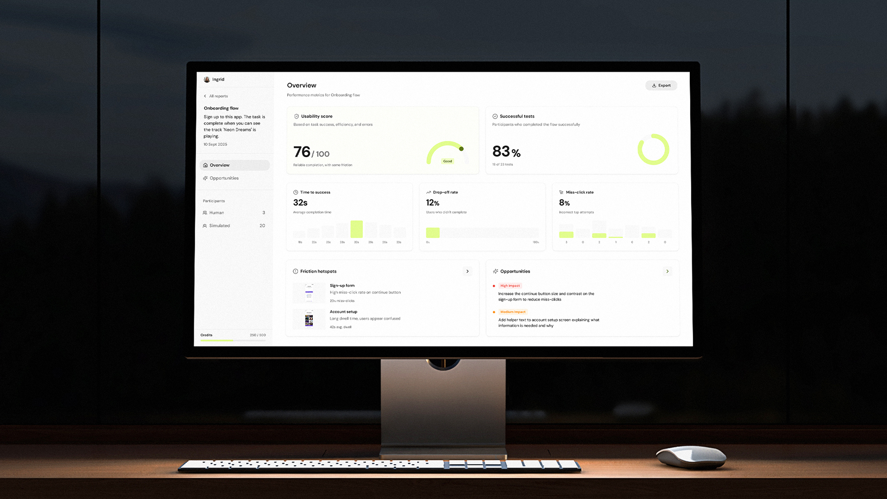
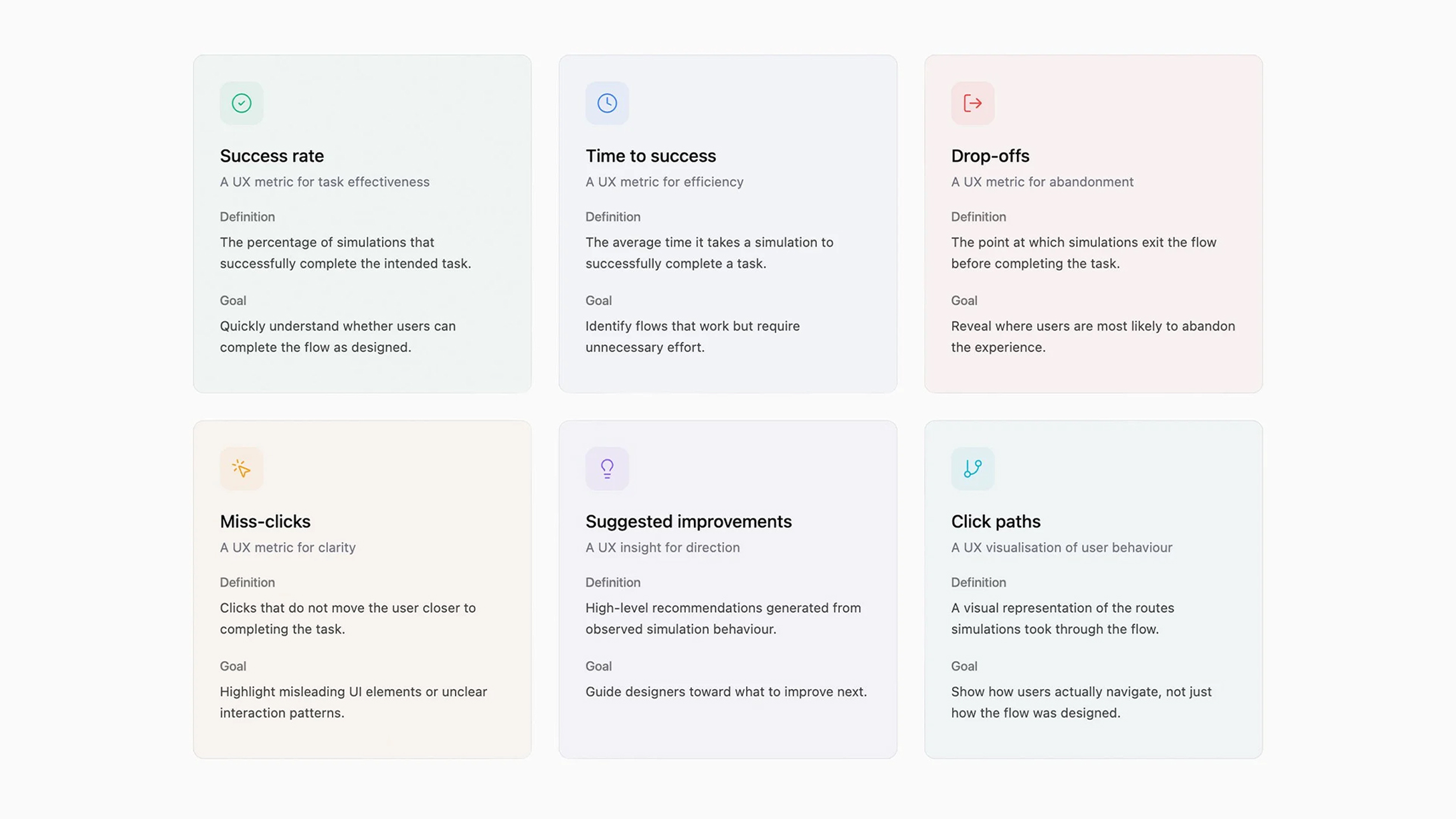
I worked with the PM and engineering to decide what data could be shown and which metrics actually mattered. At the overview level, we focused on success rate, time to success, drop-offs, and miss-clicks, alongside a small set of suggested improvements. More detailed data, such as user paths and deeper insights, were only shown when users chose to dig deeper, helping avoid overwhelming them with too much top level data.
Product research
I looked at familiar patterns in analytics and usability tools to understand how metrics were commonly designed in order to make sure the dashboard felt clear to designers.
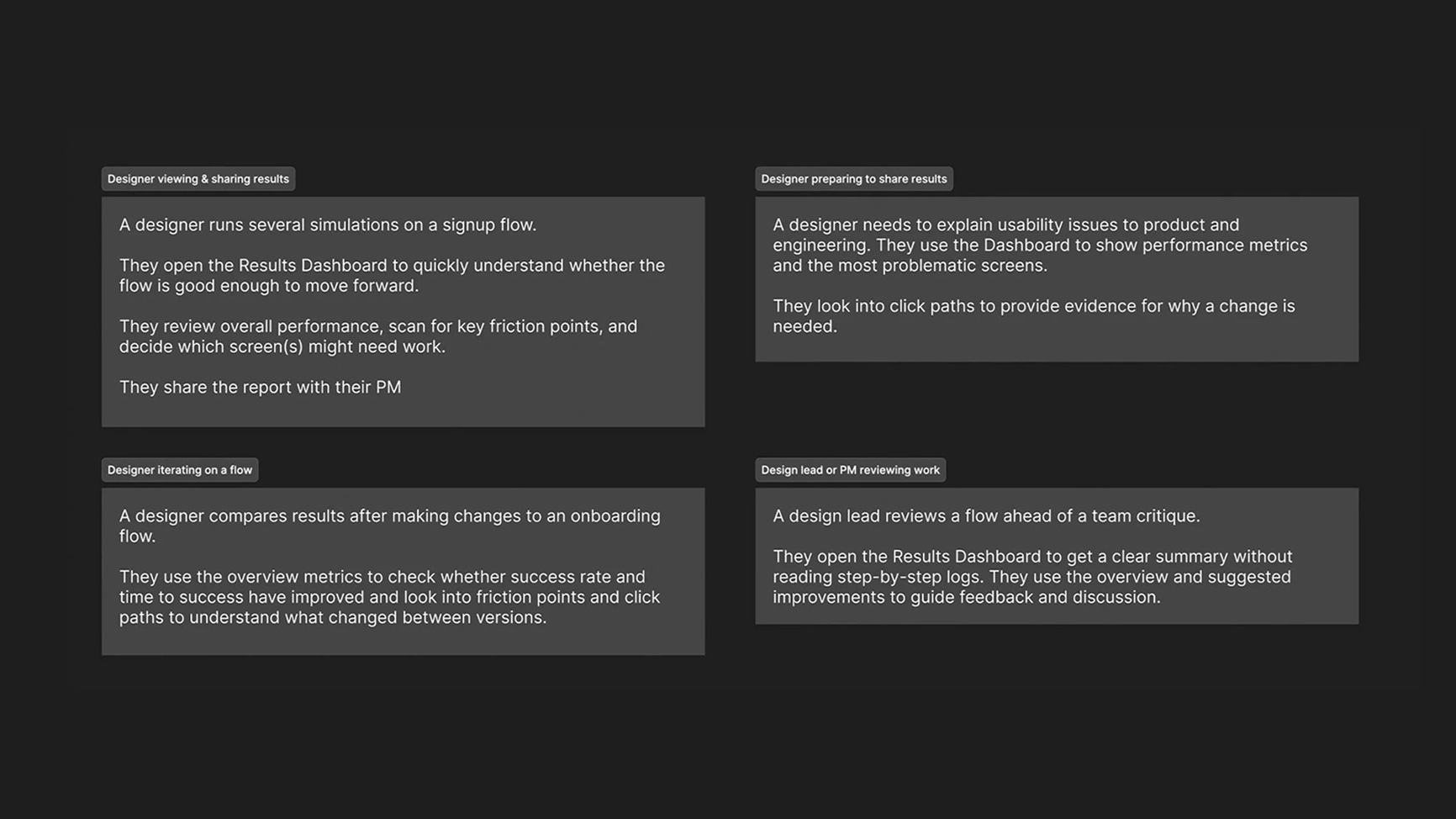
User scenarios
Before designing the results experience, I mapped out a few core user scenarios to understand how designers and stakeholders would actually review, interpret, and share usability findings. This helped me focus the dashboard on clarity, quick decision-making, and evidence that's easy to communicate.
Prototype & test
This was a completely new part of the product, so I wanted to test assumptions before going deep on the designs. I used Figma Make to build a working prototype using our existing design system, I tested the design with some existing users, iterated on what wasn't working, then brought the refined designs back into Figma for dev handover.
Early testing showed that users wanted a clear, high-level overview and a fast way to judge overall performance. As a result, we introduced the Usability Score to summarise flow success at a glance. We also removed the persona analysis as this was confusing users but kept the user paths.
.gif)
Final designs
Design details
Overview
I designed the dashboard to show a clear overview first, followed by detailed metrics and actionable insights. This aligned with how users reviewed simulations in practice by starting broad, then drilling into specifics.
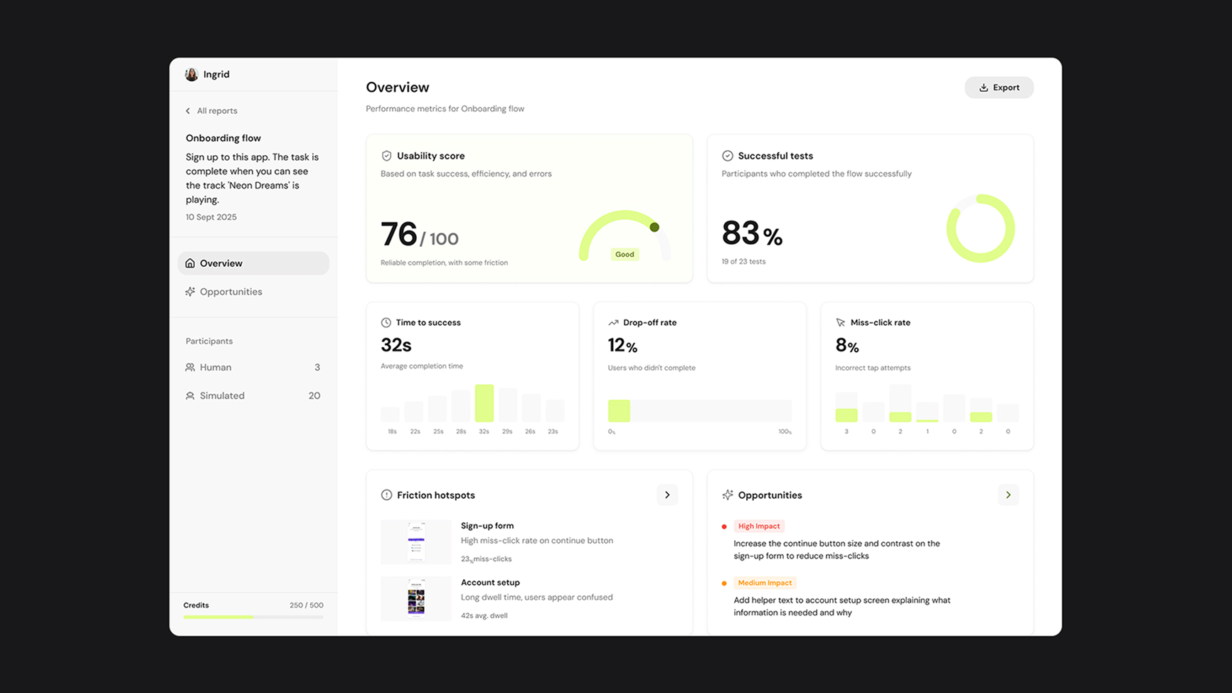
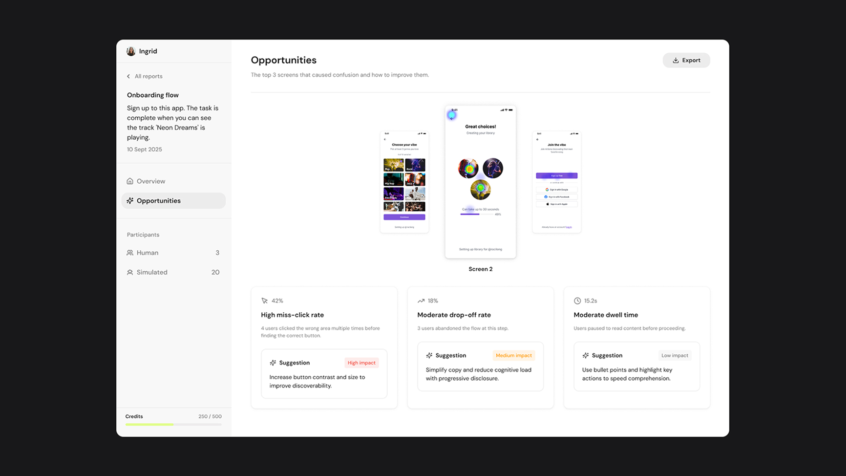
Opportunities
While the Overview supports fast interpretation, the Opportunities page is designed for diagnosis and action, linking metrics directly to the screens and behaviours that caused friction.
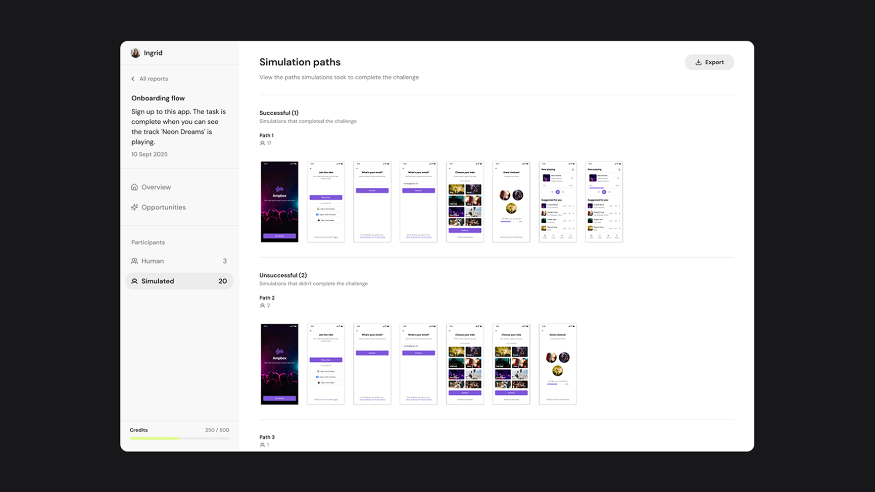
Simulation paths
This view was designed to show the exact user behaviour, showing the steps taken through the flow so teams can trace outcomes back to real interactions.
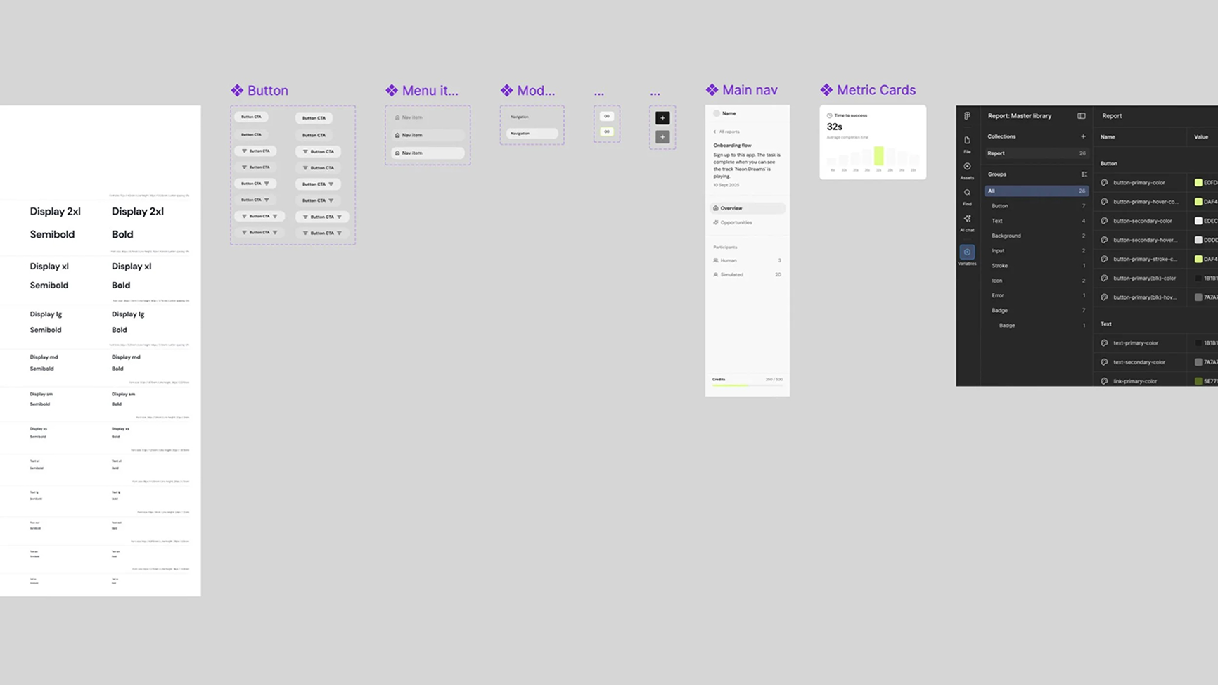
Design system
I started to build out a new design system for this part of the product to ensure consistency, scalability, and faster iteration as the dashboard expanded.
Impact
The Results Dashboard fundamentally changed how designers used Velocity. Before, users would run a simulation, get a pass or fail, and leave. With the dashboard, they could see exactly where their flow broke down, why, and what to fix, then run another test and see the improvement. This turned Velocity from a one time testing tool into an iterative part of the design process.
The impact showed up in the numbers with the average session time nearly doubling from 9 to 16 minutes. Returning users increased by 40% as designers came back to dig into results, compare tests, and share findings with stakeholders. And because results could now be shared via link, 58 new users signed up in the first month after being sent a report by a teammate.
Reflection
This project highlighted that users don't want to spend time analysing raw metrics, they want clear signals about what matters, with the ability to explore further when needed.
If I had more time…
- Look at how users compare results between reports and how this could be optimised.
- Test how teams use the dashboard collaboratively when sharing results between them and with stakeholders.
My key learnings:
- When data is complex, clear hierarchy and visual cues make it much easier for people to understand what's actually going on.
- Users care more about knowing what to do next than seeing every possible metric.