Velocity
Scorecard
Designing a scorecard that gave enterprise leadership a business case for UX investment, agentically coded in 2 days, sold in a week.
Impact
2 days
agentic prototype built and presented to client
1 week
from first conversation to purchase intent
$300k+
estimated annual contract value
Business context
Velocity's core users were designers running simulations and analysing flows. But the people making buying decisions were usually a level or two above that. They didn't want to watch simulation recordings or dig through UX reports.
They wanted to know how their product compared to competitors and what fixing it was worth in revenue terms. There was nothing inside Velocity that currently gave that information.
My role & Team:
I was the sole designer on the Scorecard, owning the problem framing, research, and end-to-end design. I worked closely with our PM throughout, and brought in one of our engineers early to sense-check feasibility before we shared anything with the client.
Timeline:
1 week, February 2026
"The insights are really valuable but I'm struggling to convince my leadership team why we should be paying for this"
Saghi
Senior Designer
"Can we show how much money design improvements saved?"
Jill
Innovation Manager
Problem
A pattern kept coming up in feedback from enterprise users, they were struggling to demonstrate the monetary value that Velocity would bring to their organisation. They could see the simulation data, they understood what it meant, but they had no way to show leadership why it was worth investing in.
One enterprise client showed this clearly, they were a global life sciences company with 93,000 employees, 100+ designers, and $16.3B in revenue. Their Innovation Manager was championing Velocity internally, but the Head of User Experience and Design needed to know how Velocity would save or make them money before he could take it further up.
This pointed to a clear opportunity, could we design something that translated Velocity's simulation output into a format that aligned with how leadership actually think, which was in revenue.
Hypothesis
If senior stakeholders could see their product's UX performance ranked against competitors and tied to revenue impact, they'd be able to make the case for investing in improvements.
Approach & rationale
We had enterprise users close to converting but we weren't quite meeting their needs. We needed to show we were listening and move fast before we lost the momentum. I knew I could get something fully interactive in front of them quickly using agentic coding tools, so I prioritised speed to value over a lengthy design process.
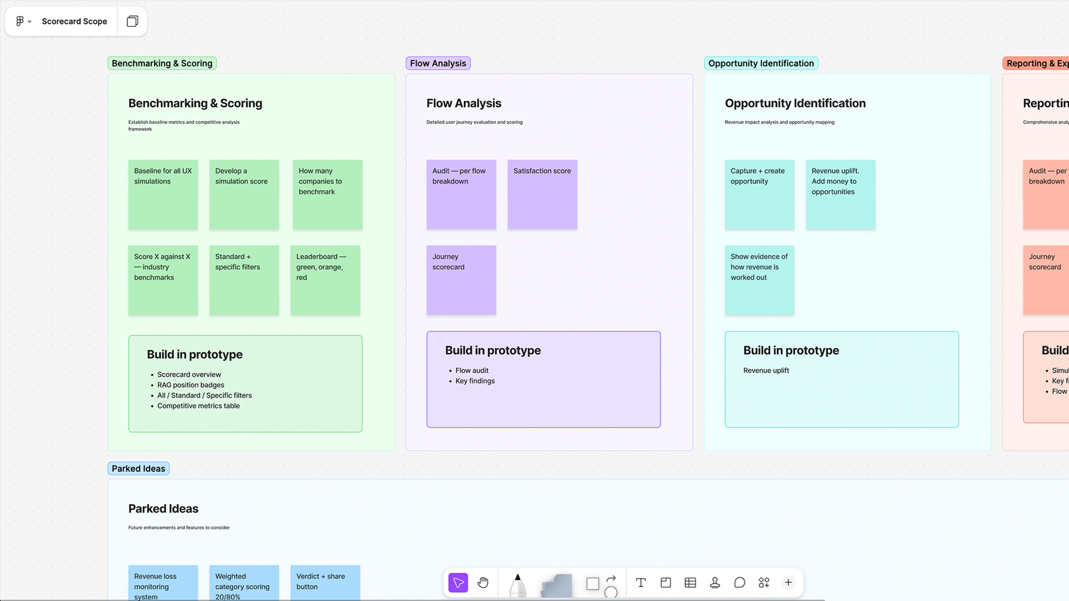
Before building, I mapped out the full scope with my PM, this meant we could make fast decisions about what to cut and be confident we were building the right thing.
Prototyping the design
I built the initial prototype in Figma Make, using Velocity's existing design system so it felt like a native part of the product from the start. Throughout the 2 days I ran quick internal reviews with our PM & engineer to pressure test the structure and make sure the framing was making sense. By the end of the 2nd day we had something solid enough to share with our user. Their first response was "wow, this is great, its really going to help with my conversations" I iterated on their feedback through the rest of the week.
Design details
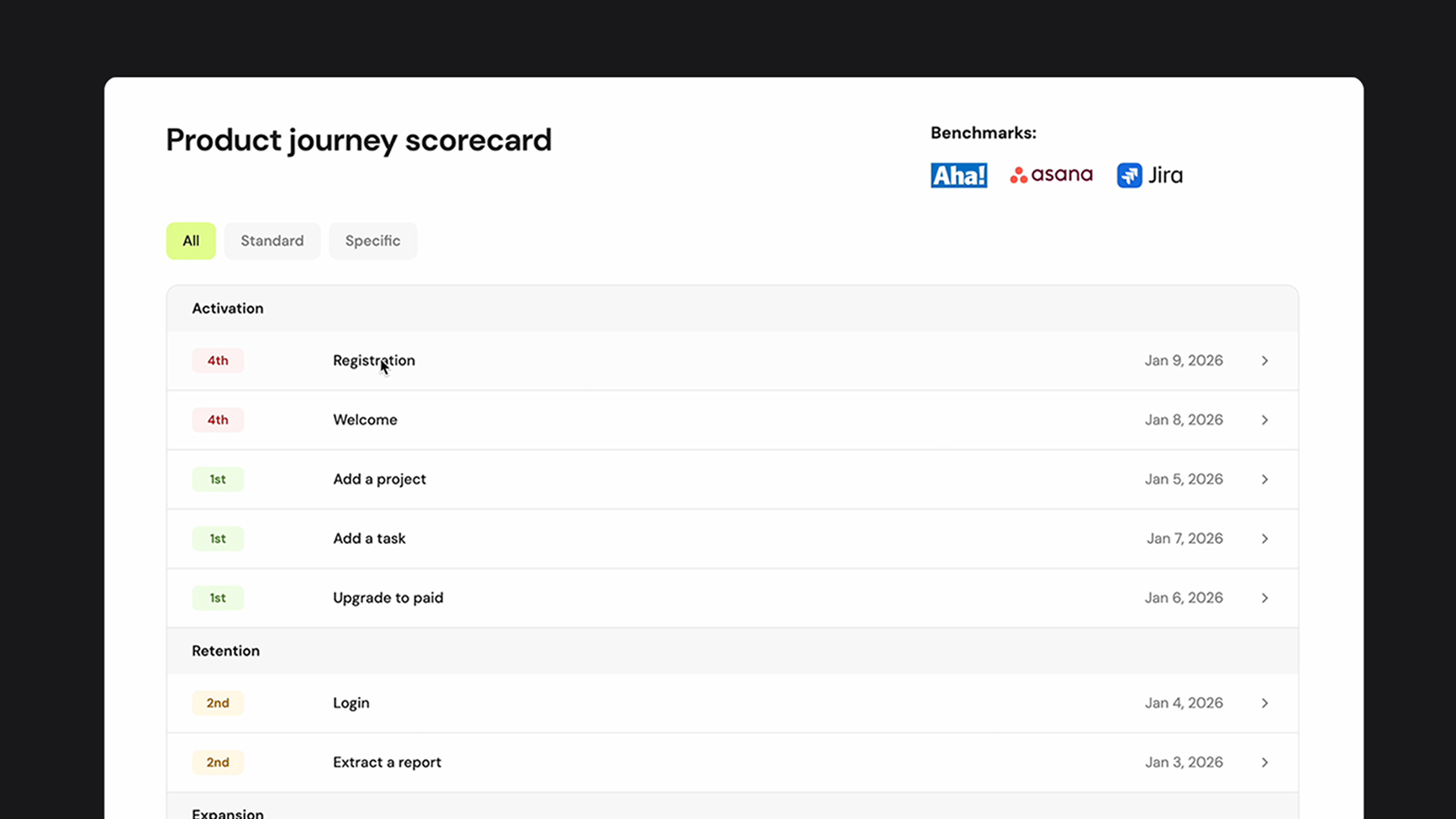
Scorecard overview
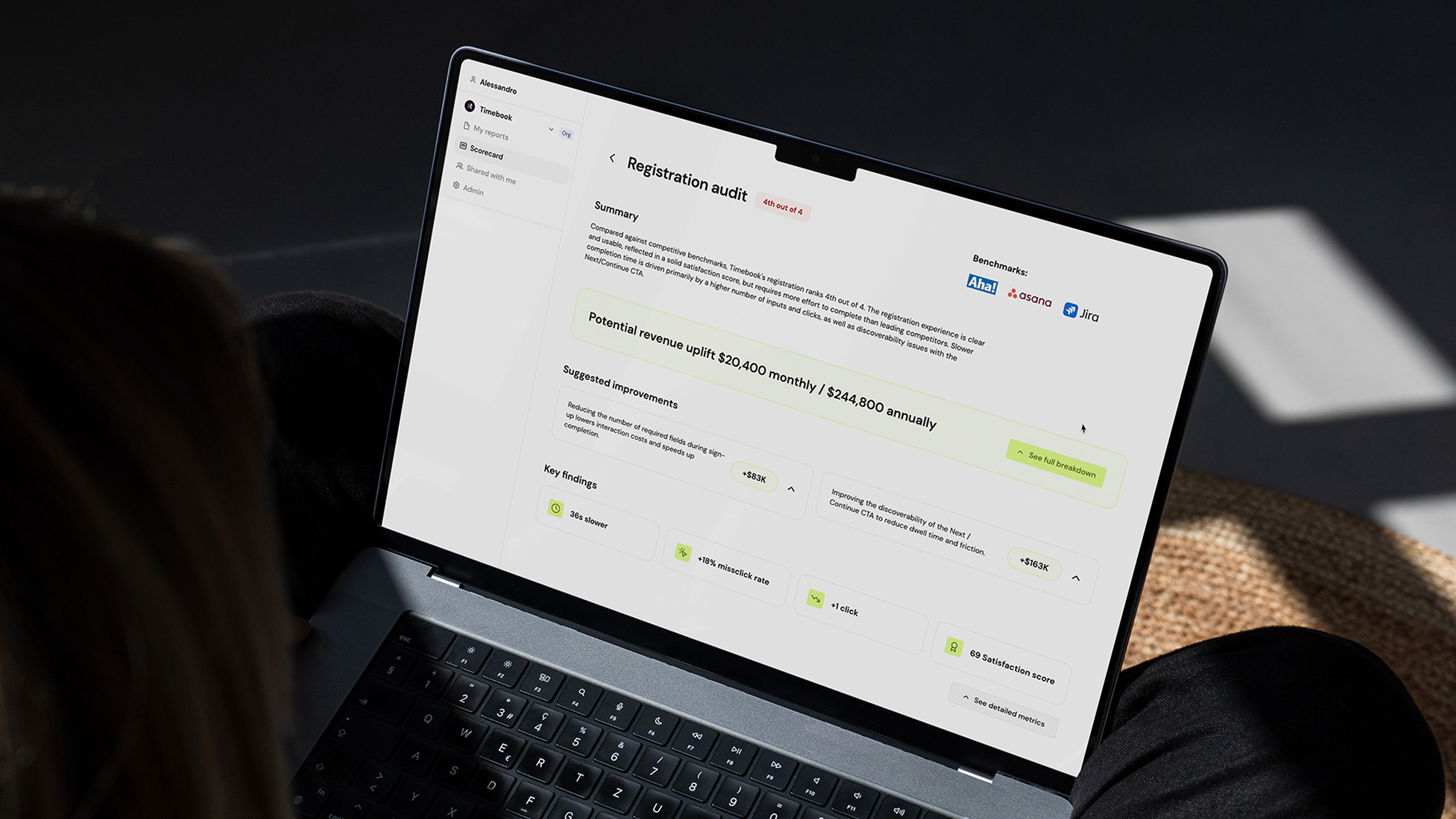
The top level showed all key user journeys: Activation, Retention, Expansion with each ranked against named competitors with a simple position badge: 1st, 2nd, 4th and scannable in seconds. A senior stakeholder could open this and immediately understand where their product stood.
Flow audit
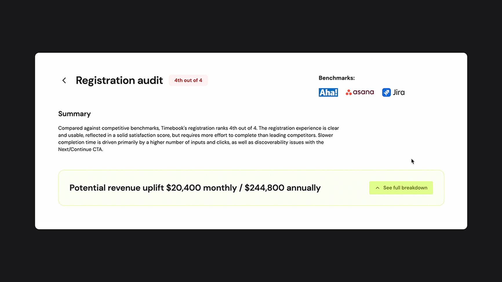
Drilling into any journey surfaced a plain-language summary of where you rank and why, with specific friction points called out clearly. The language was deliberately non-technical and written for someone who understands business outcomes, not interaction design.
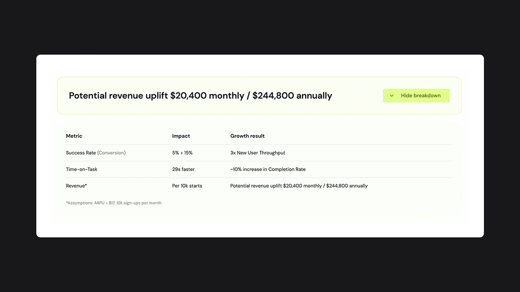
Revenue layer
This was the piece that changed the conversation. For each flow, the Scorecard calculated potential revenue uplift from the suggested improvements, based on the client's own traffic and ARPU assumptions. Not abstract UX recommendations but actual numbers. Each improvement showed its individual revenue contribution so leadership could prioritise by commercial impact rather than design opinion.
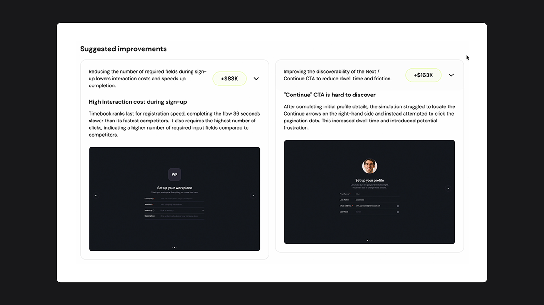
Suggested improvements
Each friction point surfaced by the simulation came with a potential fix and an attached revenue figure. These improvements were ranked by commercial impact, so instead of a backlog of UX recommendations, stakeholders got a prioritised list of changes ordered by what they'd actually be worth.
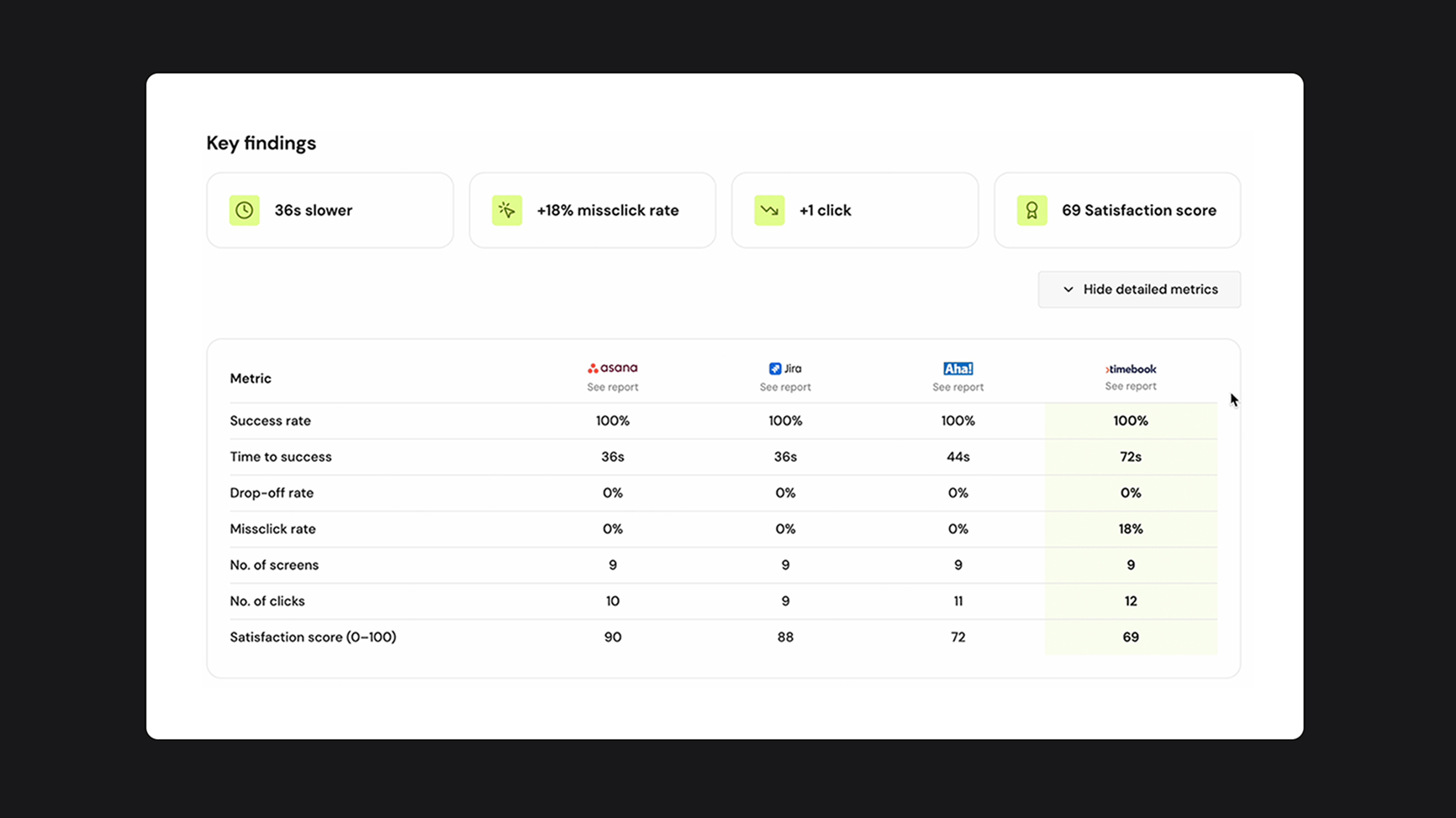
Competitive metrics table
At the bottom, a full breakdown of every metric across all competitors: success rate, time to success, drop-off, missclick rate, number of clicks, satisfaction score, for anyone who wanted the full detail. This gave the data-minded stakeholders something to anchor on without cluttering the top-level view.
Impact
I managed to get a working prototype in front of the client within 2 days. Then by the end of that week, the Innovation Manager and Head of User Experience and Design said they wanted to buy it. It was just one week from our first conversation to purchase intent and a $300K+ enterprise deal in the pipeline.
This shows the power of AI-assisted design, it's not just faster to build, but faster to validate and get buy-in.
Reflection
This project showed me how much the audience shapes the design problem. The simulation data and insights were already there, what didn't exist was a way to present them to someone whose priority was business outcomes, not interaction design.
If I had more time…
- Presented at least two prototype directions for different content hierarchies.
- Designed the sharing flow to understand how the output would be presented/shared upward.
My key learnings:
- Using AI was a great way to get in the room fast and get buy-in but this was just the first stage. There was still a lot of real design work to be done after.
- I got comfortable showing work that had been prototyped quickly and didn't look perfect yet. That was uncomfortable at first but it taught me a lot about the power of these tools for speed and validation.
- I was open about using AI to build it and because I was talking to designers at a design-forward company, that landed well but I'm aware that won't always be the case.