Velocity: Designing a results dashboard to turn AI simulation data into actionable product decisions
The results dashboard gives designers a clear overview of flow performance, highlights key friction points, and what to improve next.
Business context
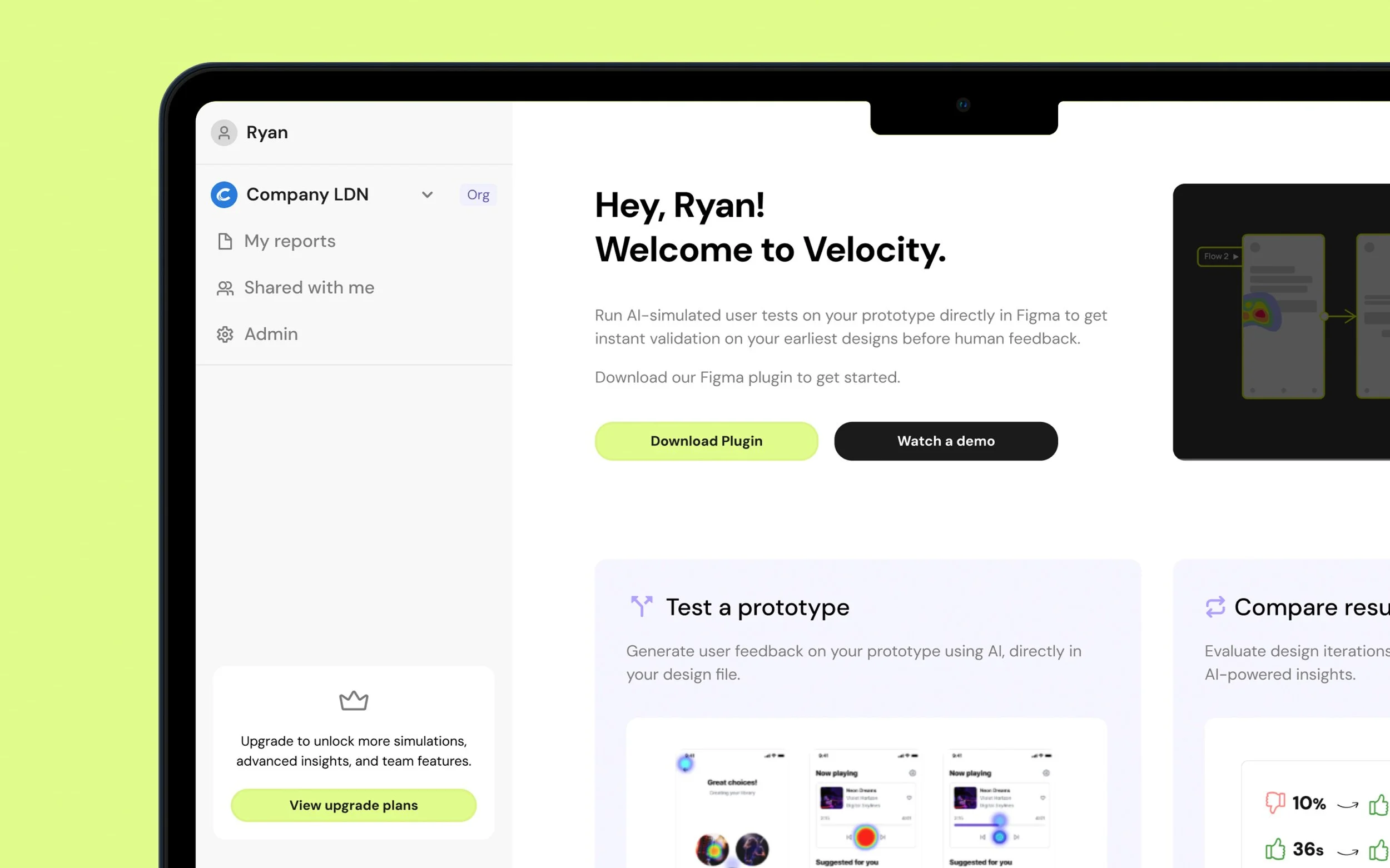
Velocity began as a Figma plugin that allowed designers to run AI-simulated usability tests directly on their prototypes. While users valued the detailed, step-by-step simulation output, it quickly became clear that the raw results alone weren’t enough.
Designers needed a way to understand overall performance at a glance and extract clear takeaways to share with stakeholders outside of Figma. Without a central place to view and interpret results, valuable insights were being lost or underused.
My role:
I was the sole product designer on the Results Dashboard, owning the problem framing, information architecture, and end-to-end design. I worked closely with product and engineering to shape how simulation data is aggregated and presented in a way that’s genuinely useful for designers.
The team:
I partnered closely with the Head of Product and engineering throughout the project, aligning design decisions with technical constraints and Velocity’s broader product direction.
Timeline
July – Aug 2025
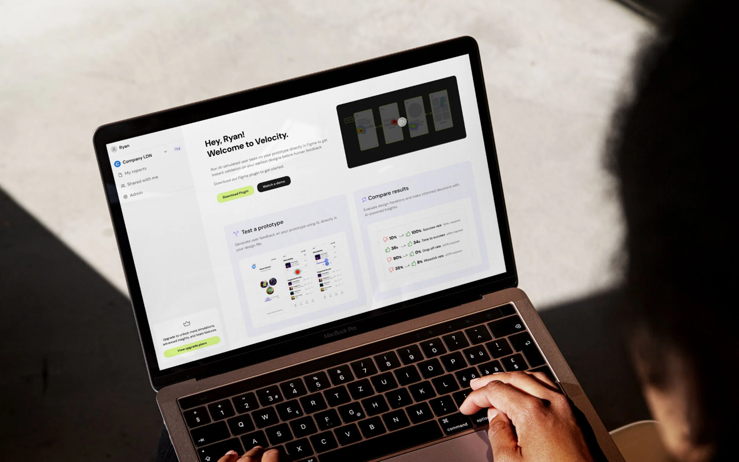
The dashboard was designed and shipped as a new core part of the Velocity experience, extending the product beyond the plugin and into a standalone web platform.
“The step-by-step detail was great, but I really wanted a higher-level view of how the flow performed”
“It would be good if it could tell me where the main issues are and then suggest ways to fix them”
“I want to be able to share the results with my team ”
Problem
User problem
Designers could see step-by-step simulation output, but lacked a clear view of how a flow performed overall. Without a summary of performance, friction, and priorities, they were forced to manually interpret results or fall back on intuition, undermining the confidence Velocity was meant to provide.
Business problem
Without a clear way to summarise and share results, the value of simulations was harder to communicate across teams, limiting adoption beyond individual designers.
Approach & rationale
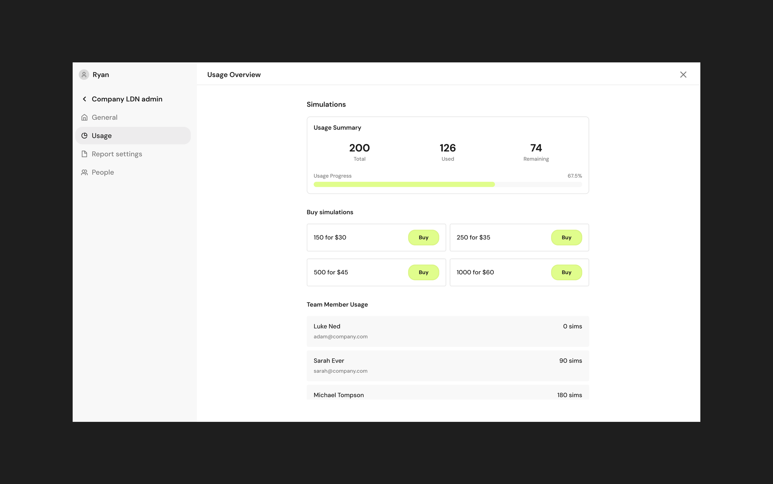
I designed the dashboard around a clear information hierarchy, starting with the high-level performance metrics before showing deeper detail. The focus was on making results immediately understandable, showing key friction points, and guiding designers toward next steps without overwhelming them with too much data. This approach ensured the dashboard worked both as a personal analysis tool and as a shared artefact for communicating results with team members.
Research
User research & insight synthesis
I speak to Velocity users weekly through ongoing discovery and feedback sessions, which gave me a strong understanding of how the product was being used in real team environments.
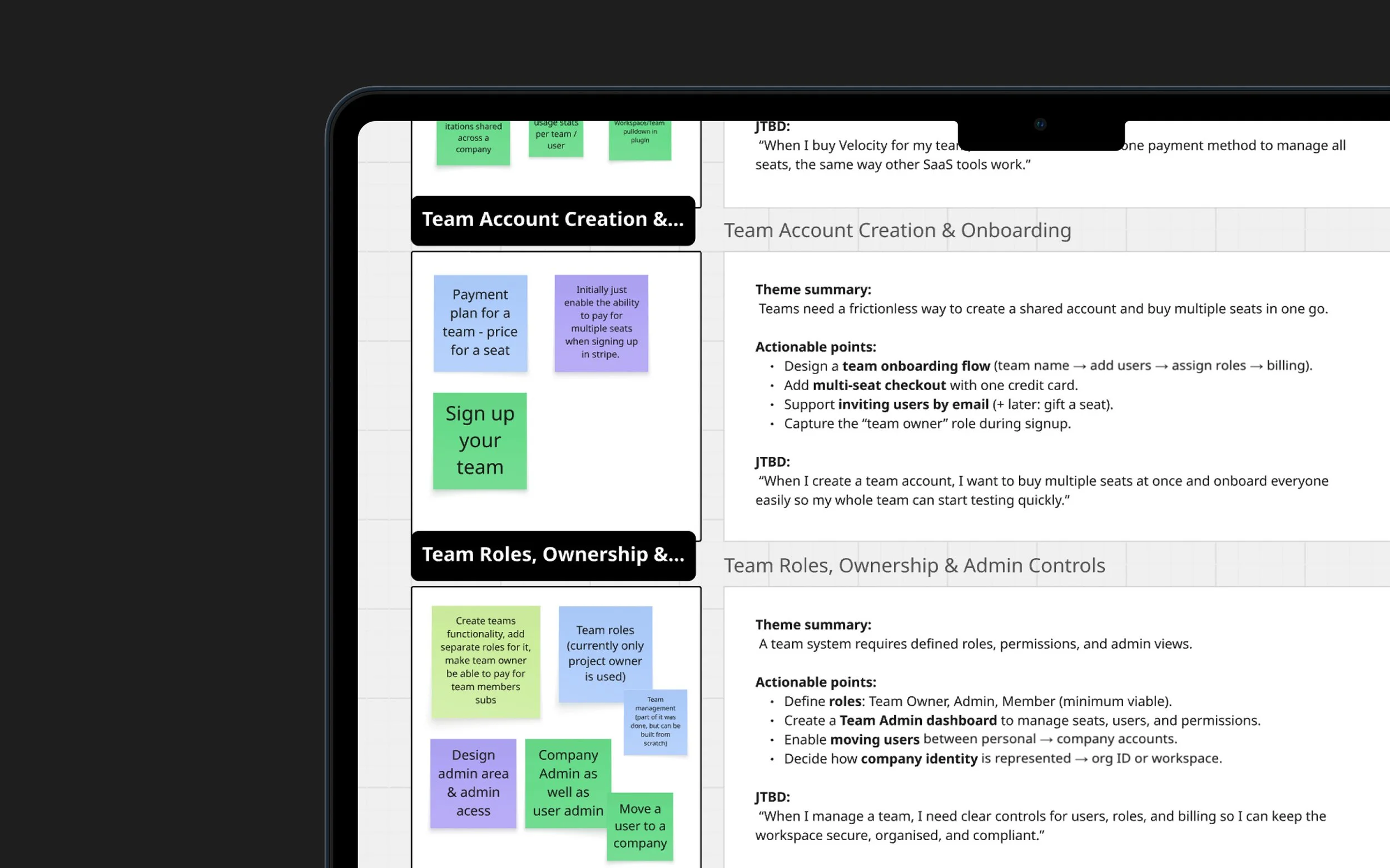
As a team, we had already explored this space through opportunity–solution mapping. I revisited that work, grouped opportunities into clear themes, translated them into actionable problem statements, and defined the key jobs to be done. This ensured the system design was grounded in real user needs and aligned across product, design, and engineering.
Product research
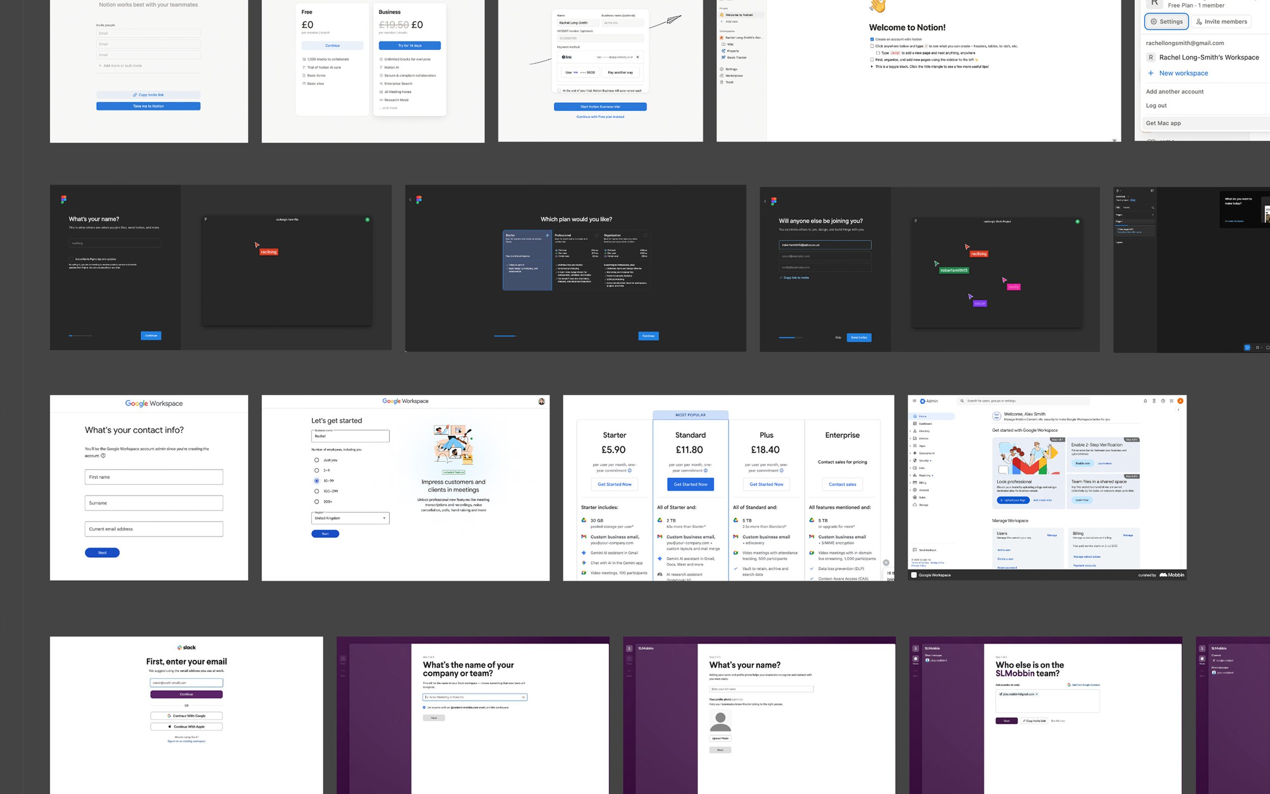
I analysed established SaaS tools used by design and product teams, including Figma, Notion, Slack, and Google Workspace, to understand common mental models around team onboarding, workspace switching, roles, and permissions.
This research focused on identifying patterns users already expect when joining teams, switching contexts, and managing access, helping reduce cognitive load by aligning Velocity with familiar behaviours rather than inventing new ones.
System planning & information architecture
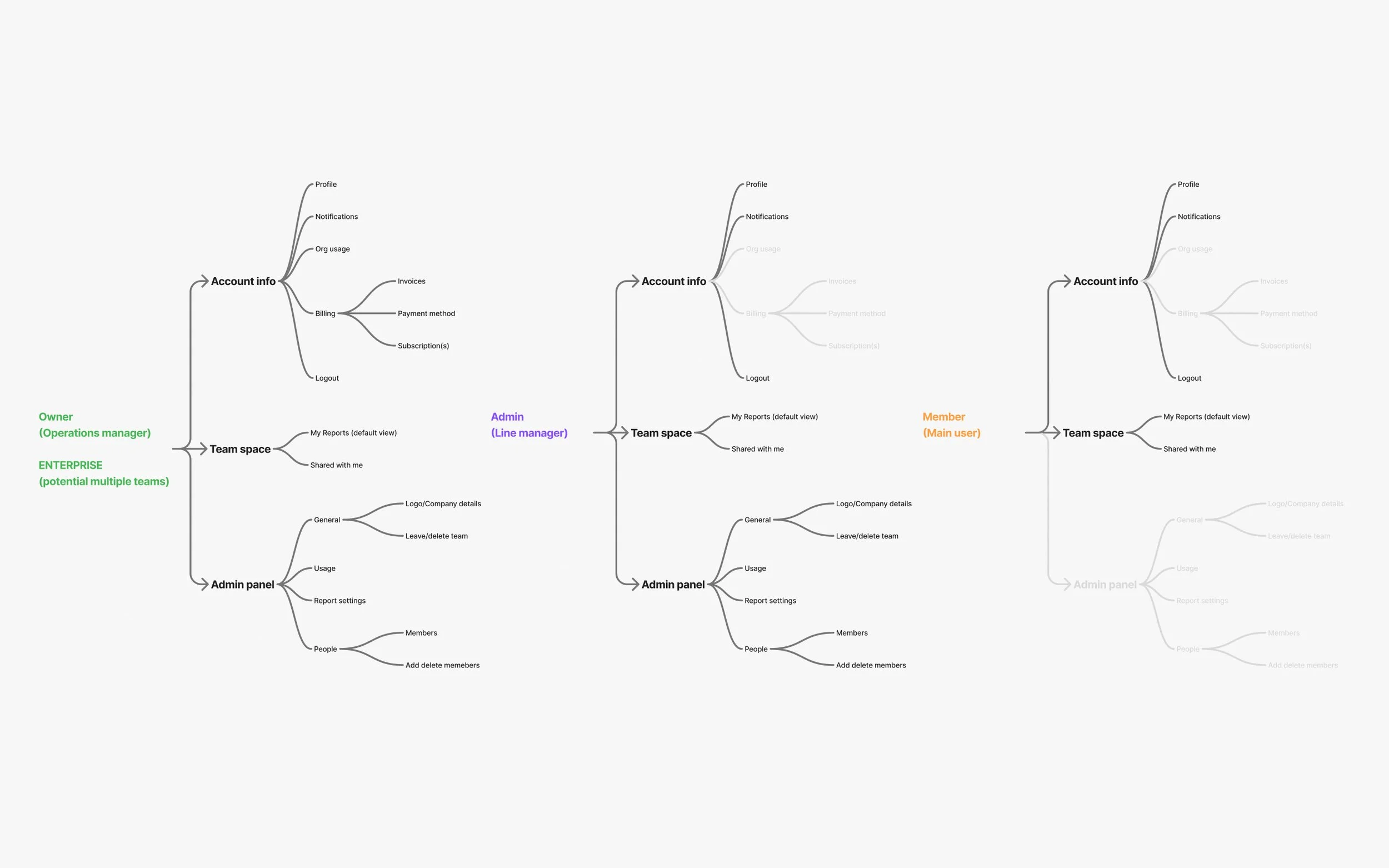
I mapped the information architecture for the workspace to understand how all the core areas fit together, including settings, billing, and member management, and how access changes by user role.
This allowed me to define clear permissions for Owners, Admins, and Members, and establish a solid structural foundation before moving into UI design.
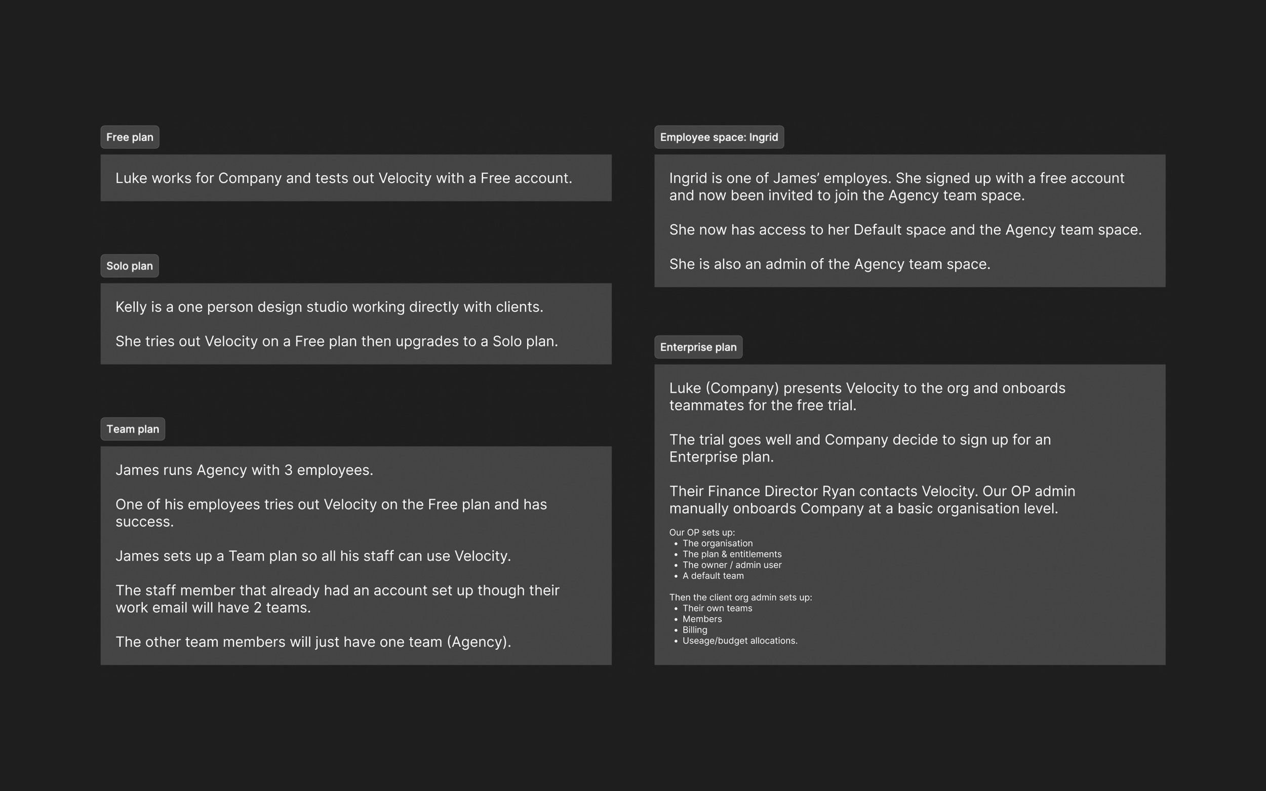
User scenarios
Before designing the onboarding, workspace navigation, user profile, and admin areas, I wrote a set of detailed user scenarios to guide the work.
The system was complex, with different roles, access levels, and plans affecting how users moved through the product so using these scenarios allowed me to clearly understand each role and ensure navigation, access, and permissions adapted appropriately across plans before moving into UI design.
Design
The design translated the system definition into clear, role-based experiences across the product.
I’m showing two representative flows (owner/admin & member) to show the core access patterns, with other roles following the same structure through constrained or extended permissions.
Design details
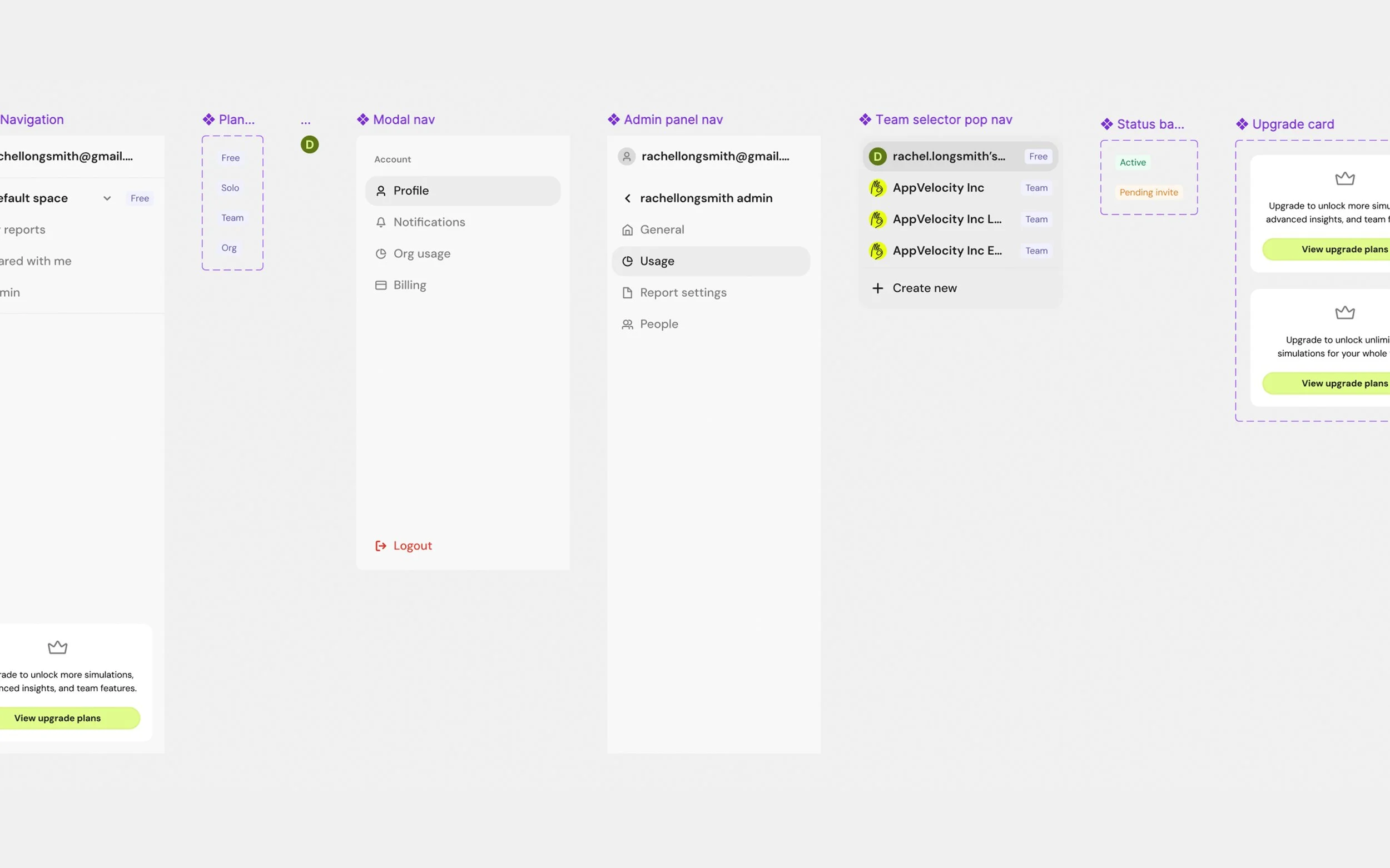
Left navigation
Velocity previously had no global navigation, so I introduced a left-side navigation as a scalable foundation for teams, workspaces, and role-based access..
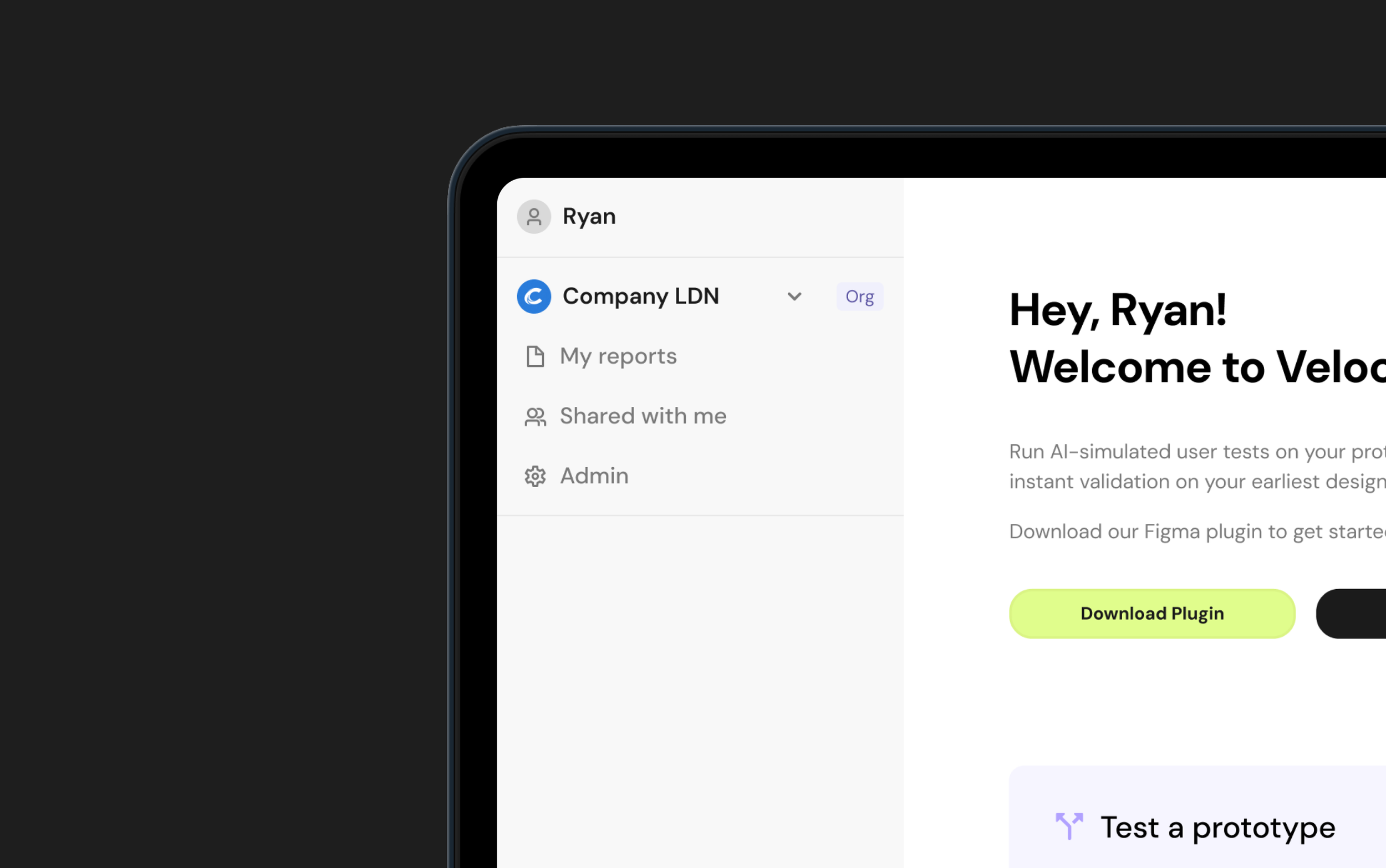
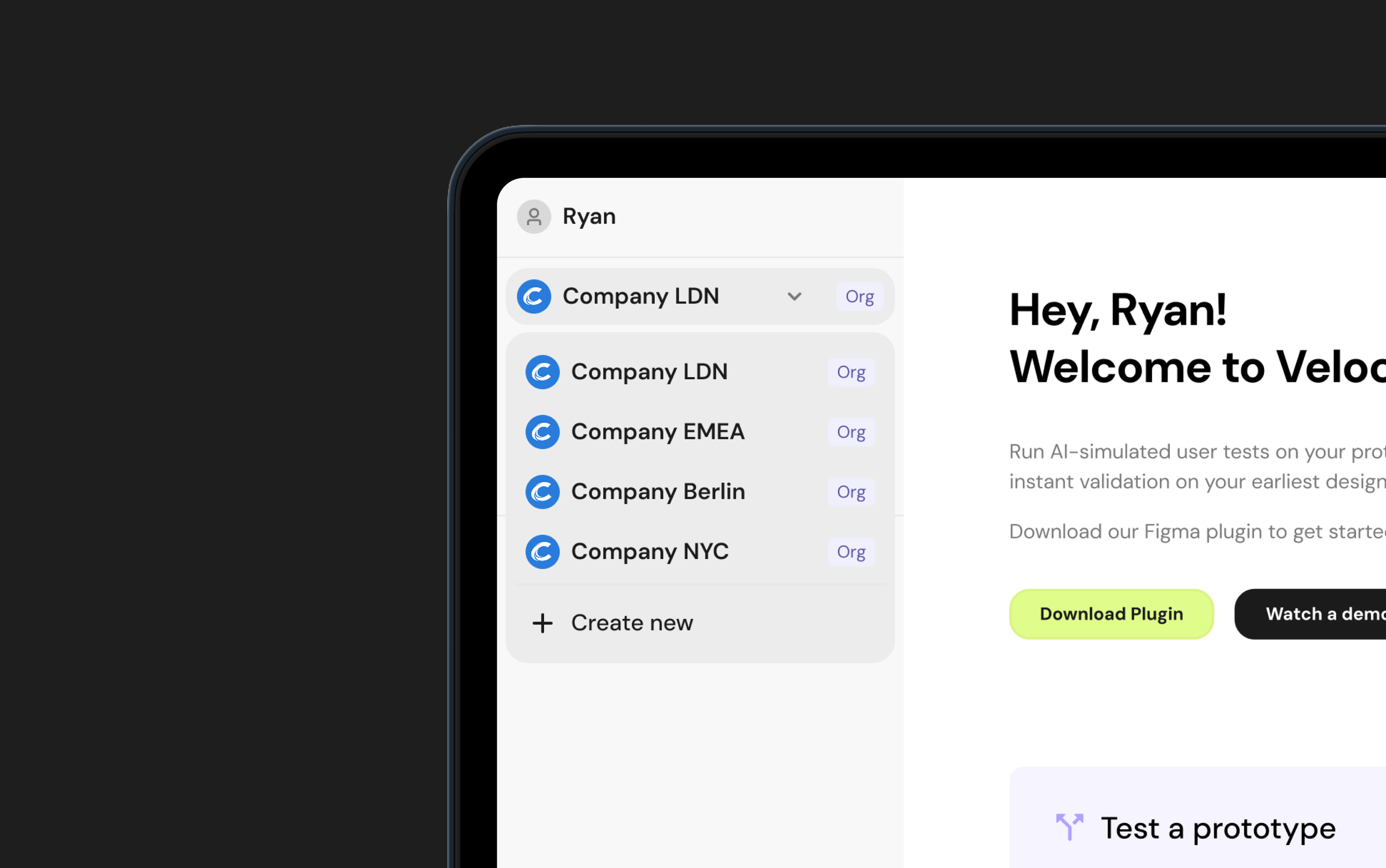
Team Space Switching
I designed team space switching as a dropdown to keep the left navigation lightweight and avoid visual clutter.
As users can belong to multiple spaces, the dropdown provides a fast, familiar way to switch contexts without overwhelming the primary navigation.
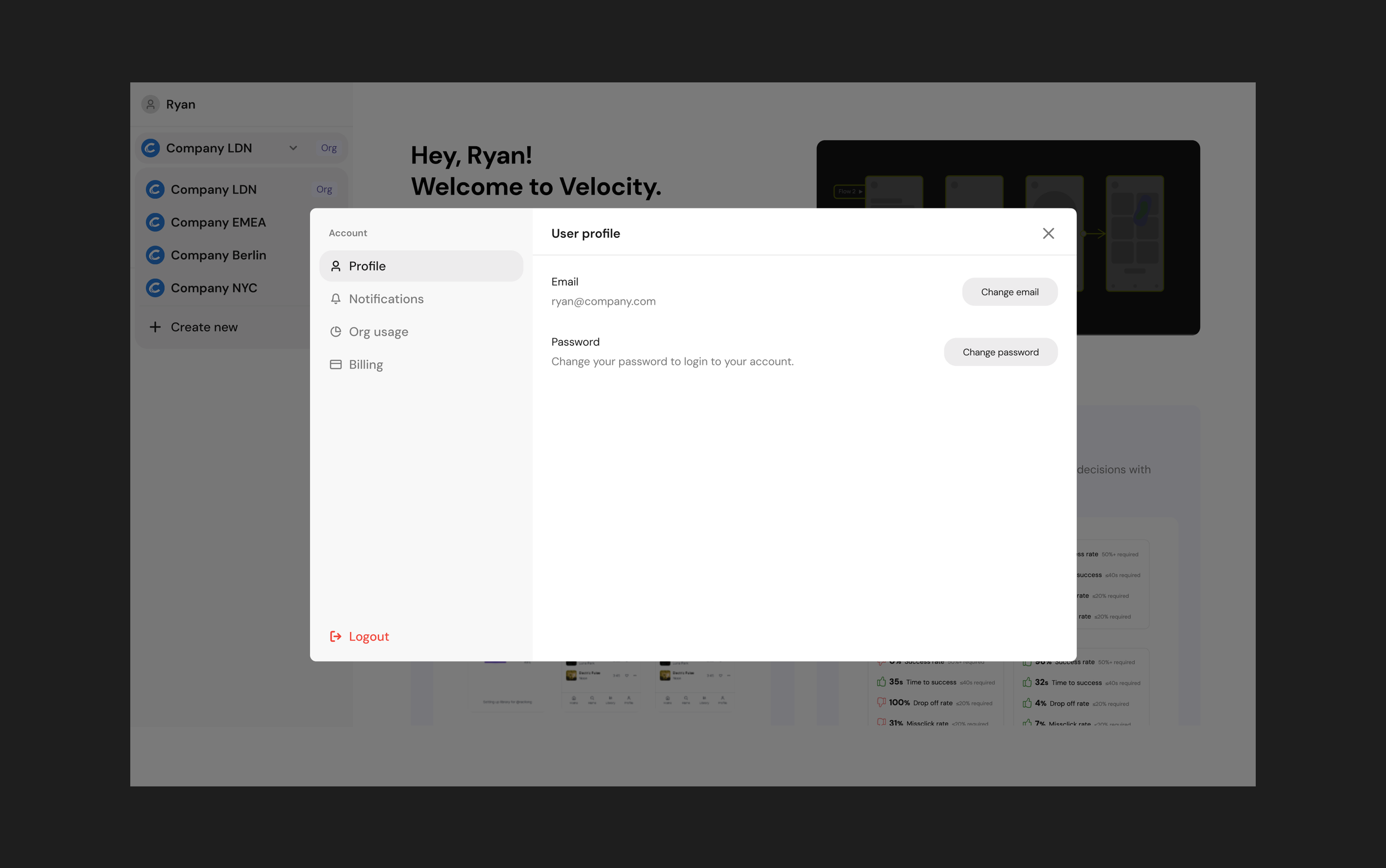
User profile
I designed the user profile as a pop-up modal to keep account details easily accessible without interrupting primary workflows.
Because profile settings are infrequent actions, this pattern keeps them out of the main navigation while remaining quick to access when needed.
Admin panel
I designed the admin panel as a secondary slide-in navigation to keep the main workspace visible while giving admins quick access to deeper settings.
This familiar SaaS pattern reduces context switching and page reloads, helping admin actions feel lightweight rather than disruptive.
Validation & iteration
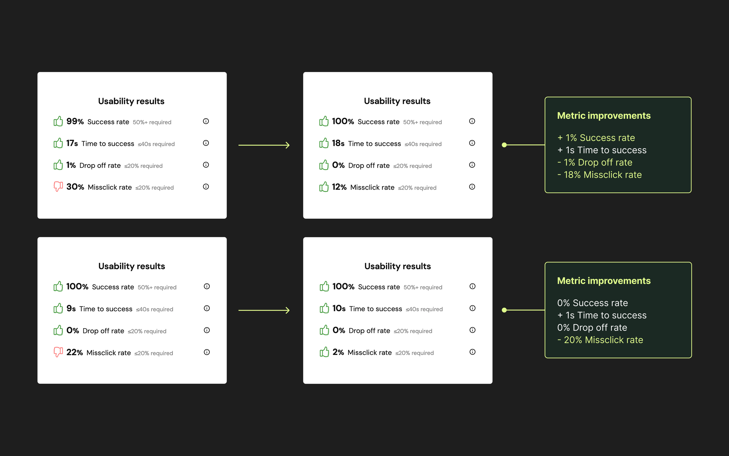
I validated the designs using Velocity’s AI-simulated user testing, running 100 simulations per flow to surface friction and confusion early. To complement the simulation data, I also ran usability sessions with two users and combined these insights with internal team reviews.
The simulation results and human testing informed small but meaningful refinements, including clearer copy and reducing the onboarding flow by one full step. These changes improved success rates and time to success, while reducing misclicks and drop-off rates.
The improved results from two of the flows are shown in the accompanying image.
Design system
As many of the Teams features were newly introduced, I extended the system alongside the product work, adding new navigation patterns, popovers, inputs, and upgrade components so the product had the building blocks it needed to scale.
Impact (pre-launch)
This project laid the foundation for Velocity to support teams and enterprise customers for the first time.
From a product perspective, it introduced a scalable system for shared workspaces, roles, and permissions, removing a key blocker to team adoption and future growth.
From a delivery standpoint, defining the system upfront and validating key flows early allowed the team to move straight into development with confidence, reducing rework and ambiguity for engineering.
The work is now in build. Once live, I’ll track onboarding completion, time to first successful simulation, role-based navigation success, and team expansion within workspaces, and update this section with live metrics.
Reflection
This project reinforced that designing for teams is about getting the underlying systems right. When roles, permissions, and structure are clear, everything else becomes easier. When they aren’t, small ambiguities quickly add up.
If I had more time…
Test the experience with real teams once it’s live, to see how it holds up in day-to-day use and where edge cases appear.
Spend more time exploring onboarding and role changes as teams grow and evolve.
Refine micro-interactions once real usage data shows where people slow down or get stuck.
My key learnings:
Writing detailed user scenarios early was hugely helpful.
Getting the system clear early made it easier to design with confidence as requirements evolved.