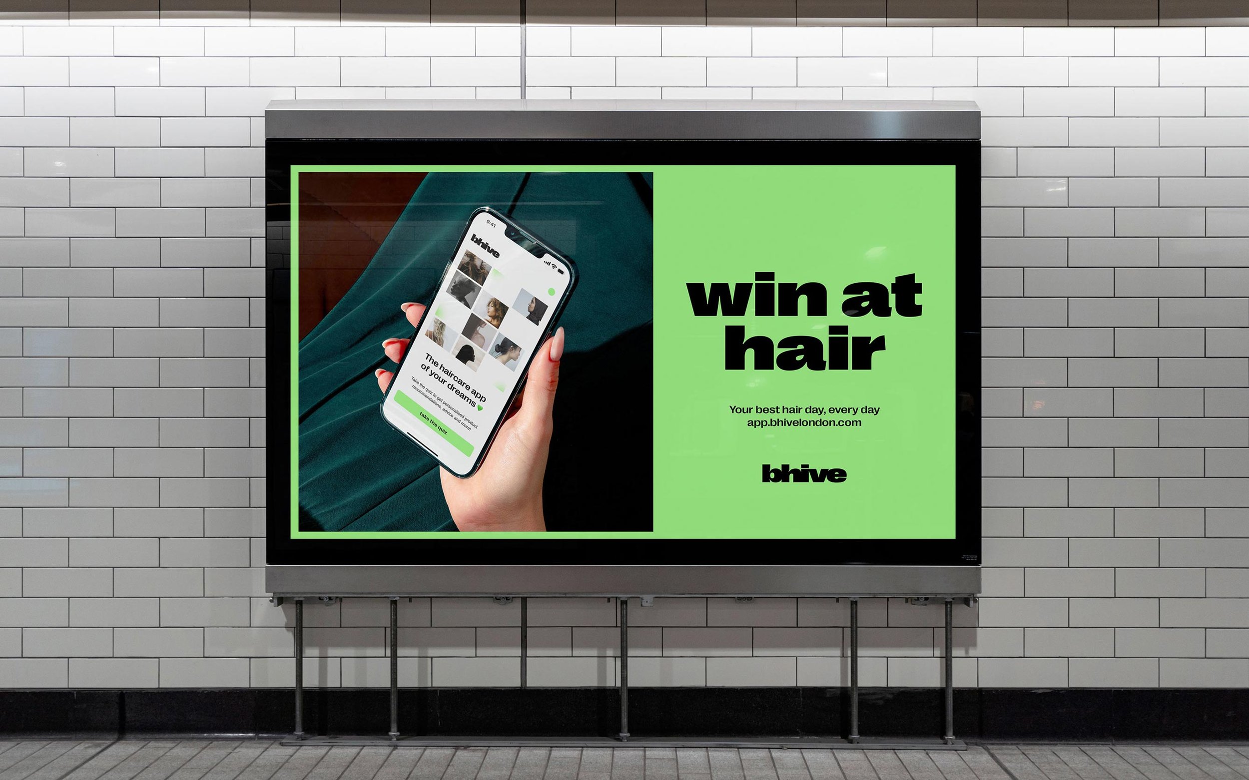
Bhive: Designing a Personalised Haircare Experience
Role: Sole Product Designer (Research, UX, UI)
Overview
Bhive is an AI-powered personalised haircare web app built to help people find products that genuinely work for their unique hair. As the sole Product Designer, I designed the end-to-end experience, from the brand and product vision to the UX, UI, and AI interactions, enabling Bhive to launch, gain traction, and attract early B2B interest.
The Problem
Choosing haircare products online is overwhelming. Gen Z and millennial users told us they struggled to understand what would work for their hair, and existing e-commerce sites offered limited personalisation.
Although thousands of reviews existed, there was no simple way to turn this data into personalised guidance. Bhive aimed to solve this by building an AI-powered recommendation engine — but we needed a clear product direction, a cohesive identity, and a user-friendly experience to make it real.
Key constraints and challenges:
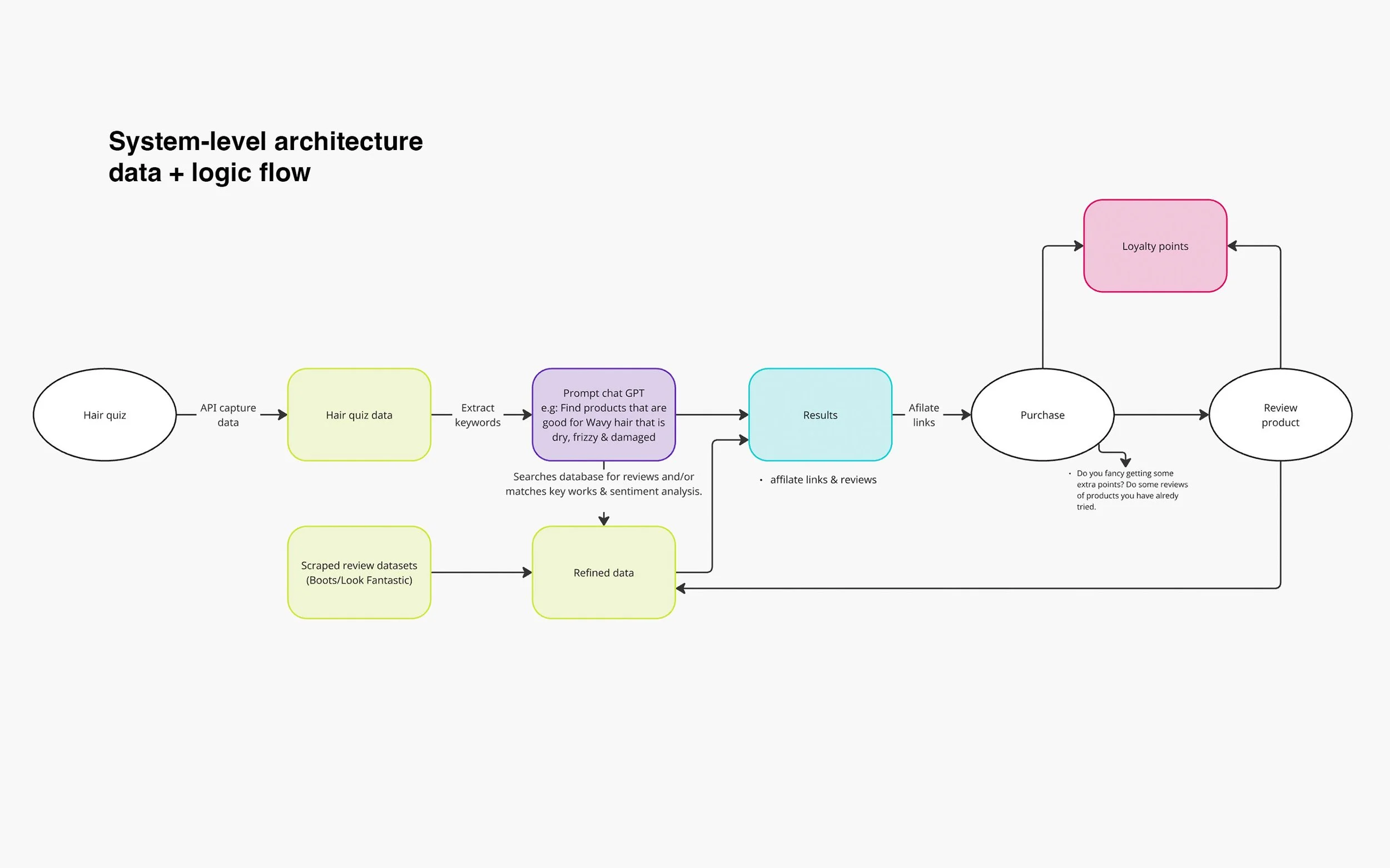
Limited product-category data and a short timeframe meant we couldn’t launch with the full vision. Multiple product types, review features, and the barcode scanner were pushed to v2 on the product roadmap.
We needed a way to collect structured data from users to deliver accurate initial recommendations and improve them over time.
The experience had to feel simple and delightful, even with complex AI logic running underneath.
The brand also needed to resonate emotionally while positioning Bhive as a tech-forward solution.
Solution
1. Understanding users & defining the problem
I carried out surveys, interviews, and lightweight research to understand user frustrations.
“I buy so many products that don’t work and waste so much money”
“There are way too many options, I have no idea what’s going to work for me.”
“I spend ages reading reviews to see if its going to work on my hair”
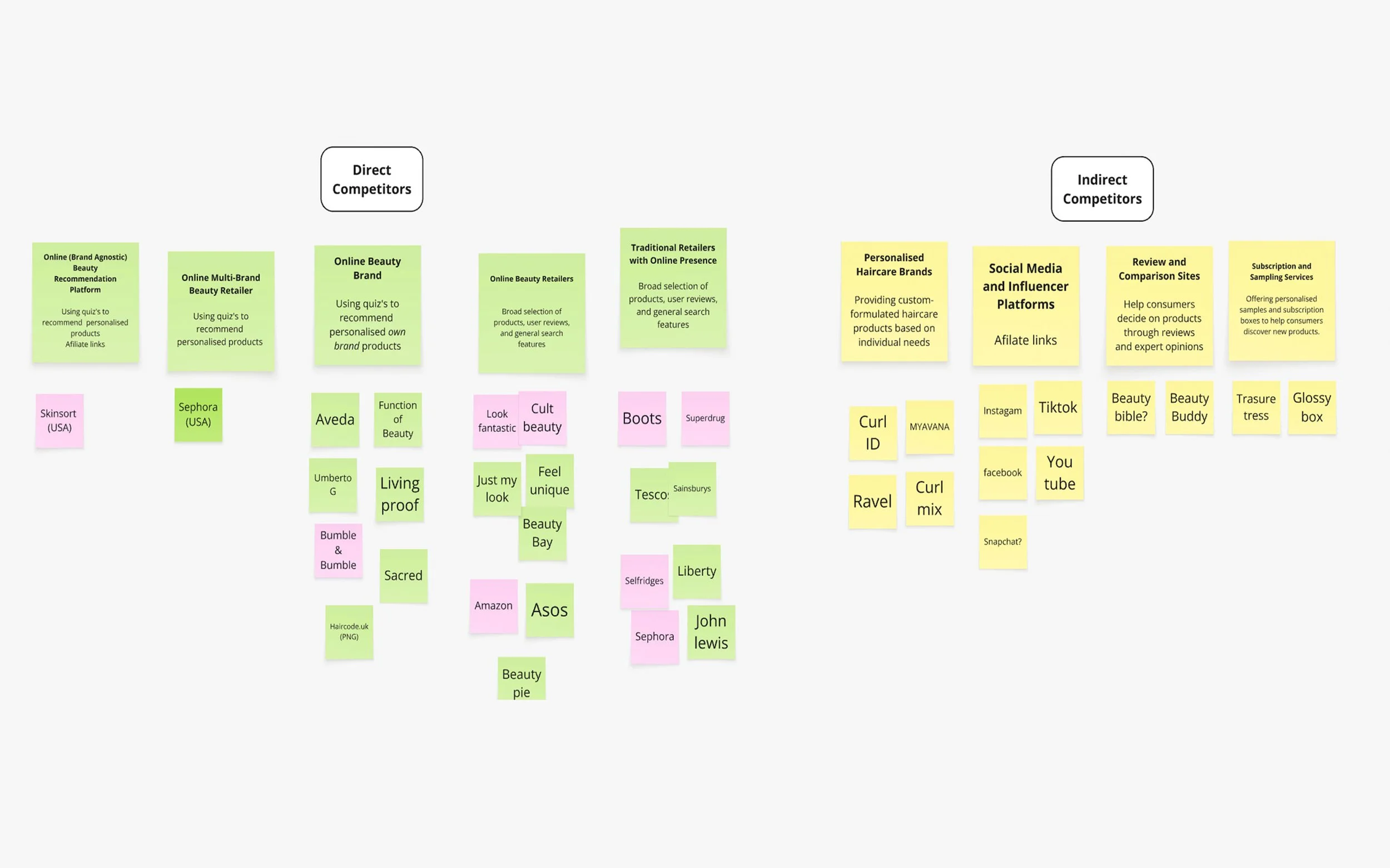
I also ran a competitor analysis across both personalised beauty platforms and major retailers to understand market gaps, common patterns, and where users were still underserved.
I then clustered all insights from my research and interviews into themes, shaping them into opportunities, JTBD statements, and hypotheses that informed the product direction and what we prioritised.
From this, the core job became clear:
Help users quickly understand what will work for their hair and why.
I mapped user goals, pain points, and the ideal end-to-end experience before designing anything.
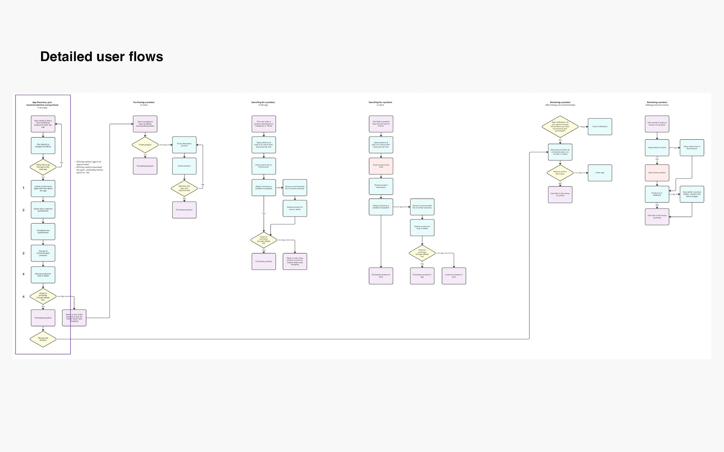
2. Designing the experience
I translated the user insights into a structured, scalable product experience:
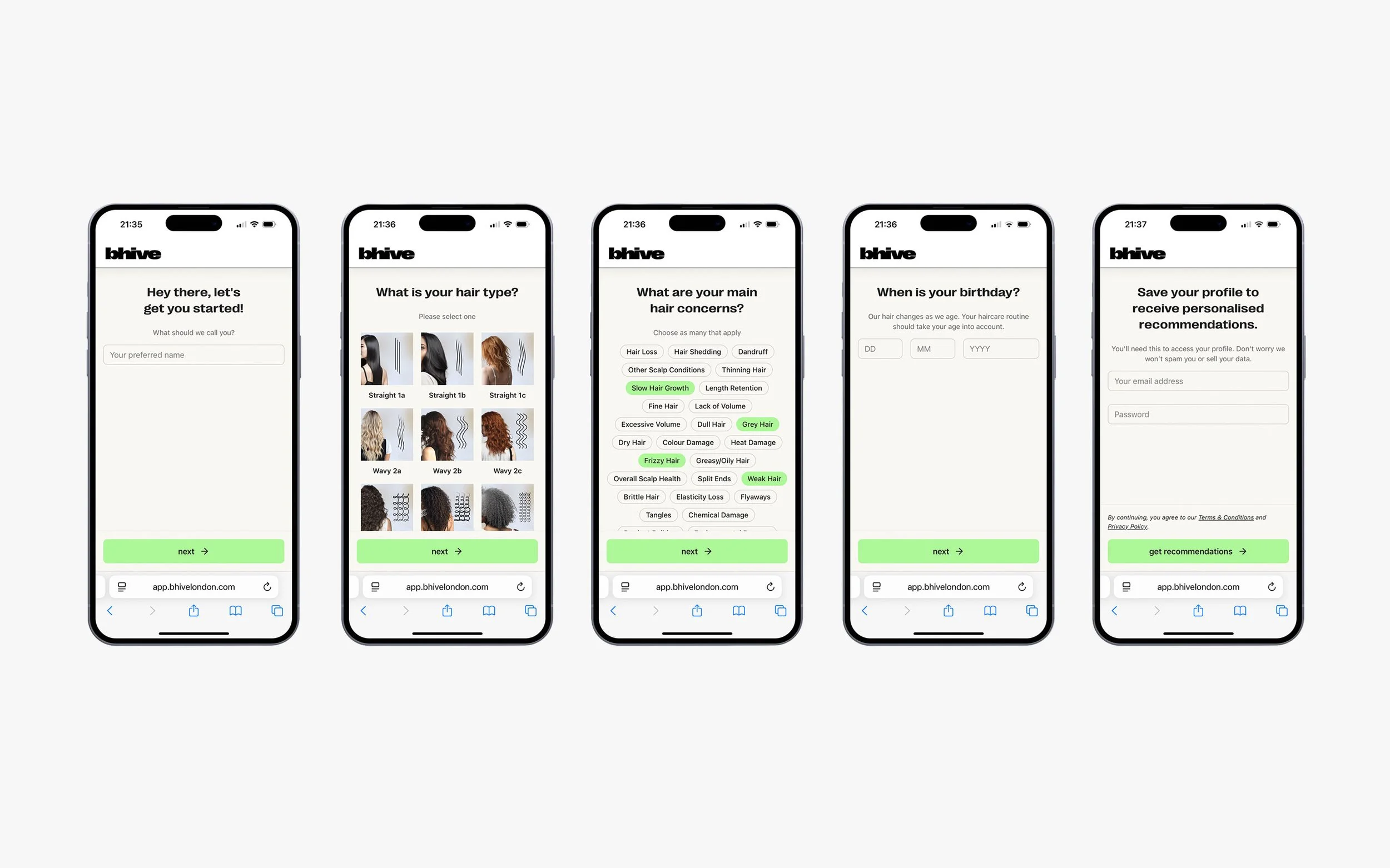
Onboarding Quiz
Designed a clear, friendly quiz to capture accurate hair profiles.
Balanced detail with speed to keep completion rates high.
Created input patterns that fed directly into the recommendation engine.
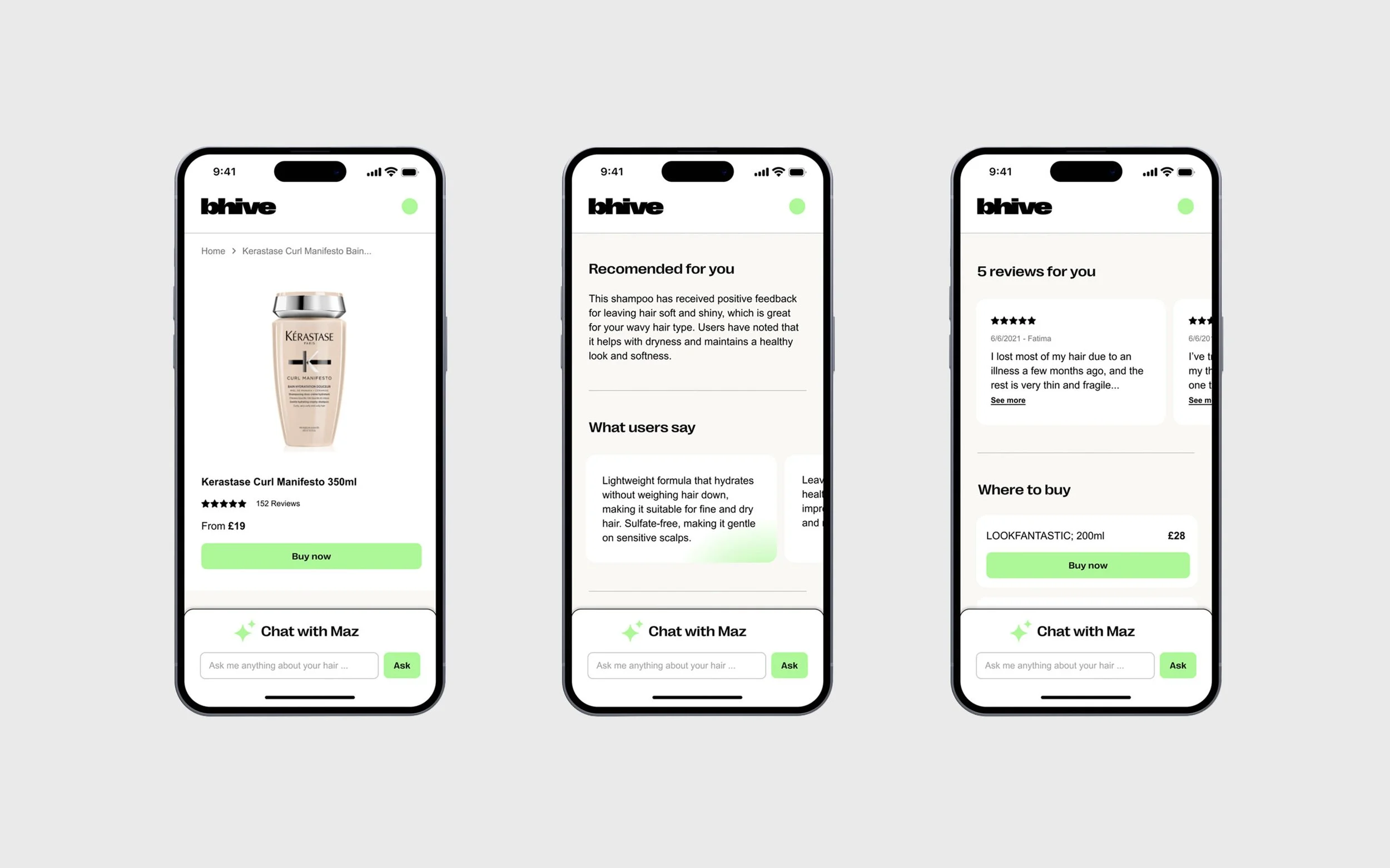
Recommendation Flow
Designed the results UI to explain why products were matched
Focused on transparency to build user trust.
Prioritised scannability and product comparison.
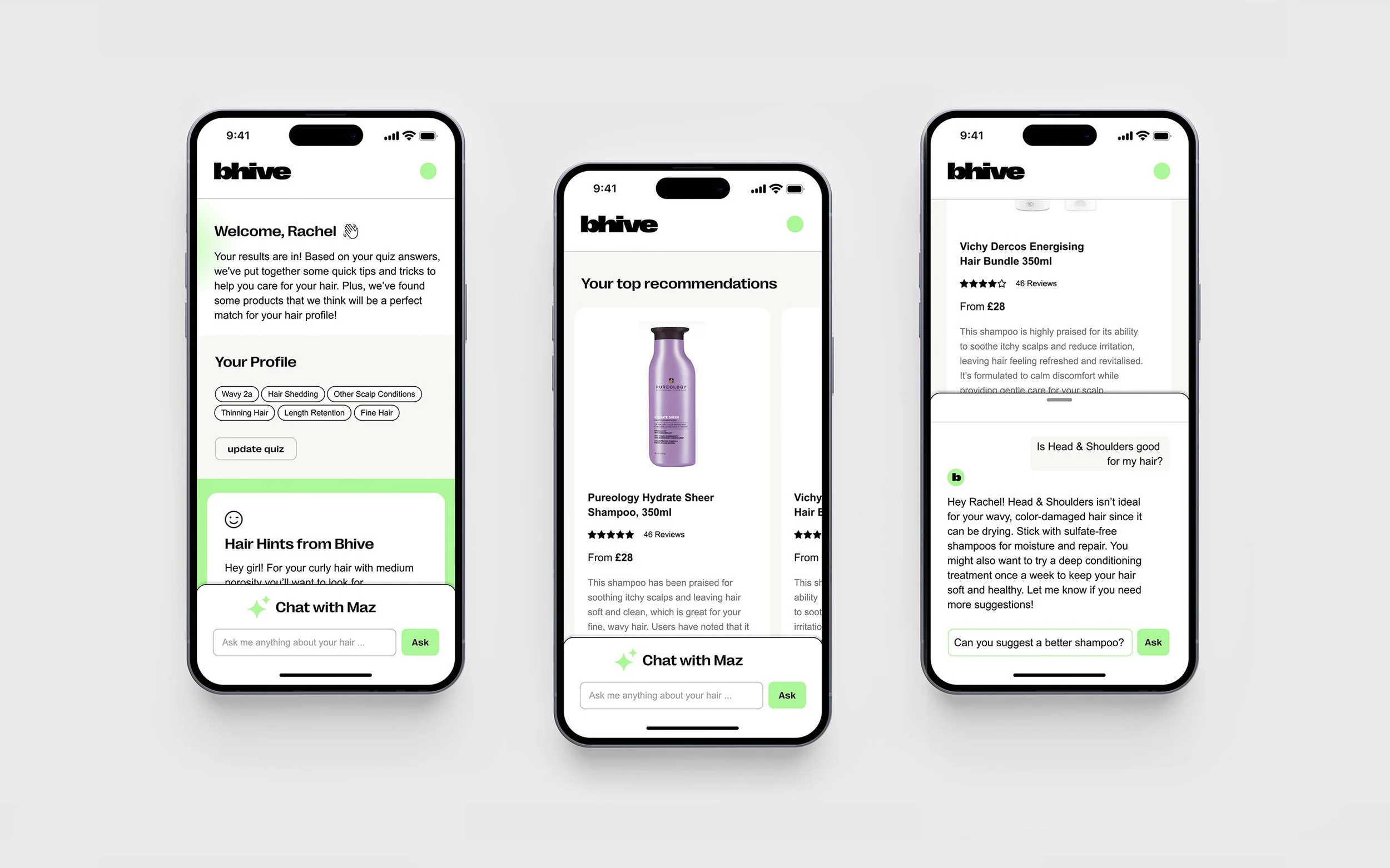
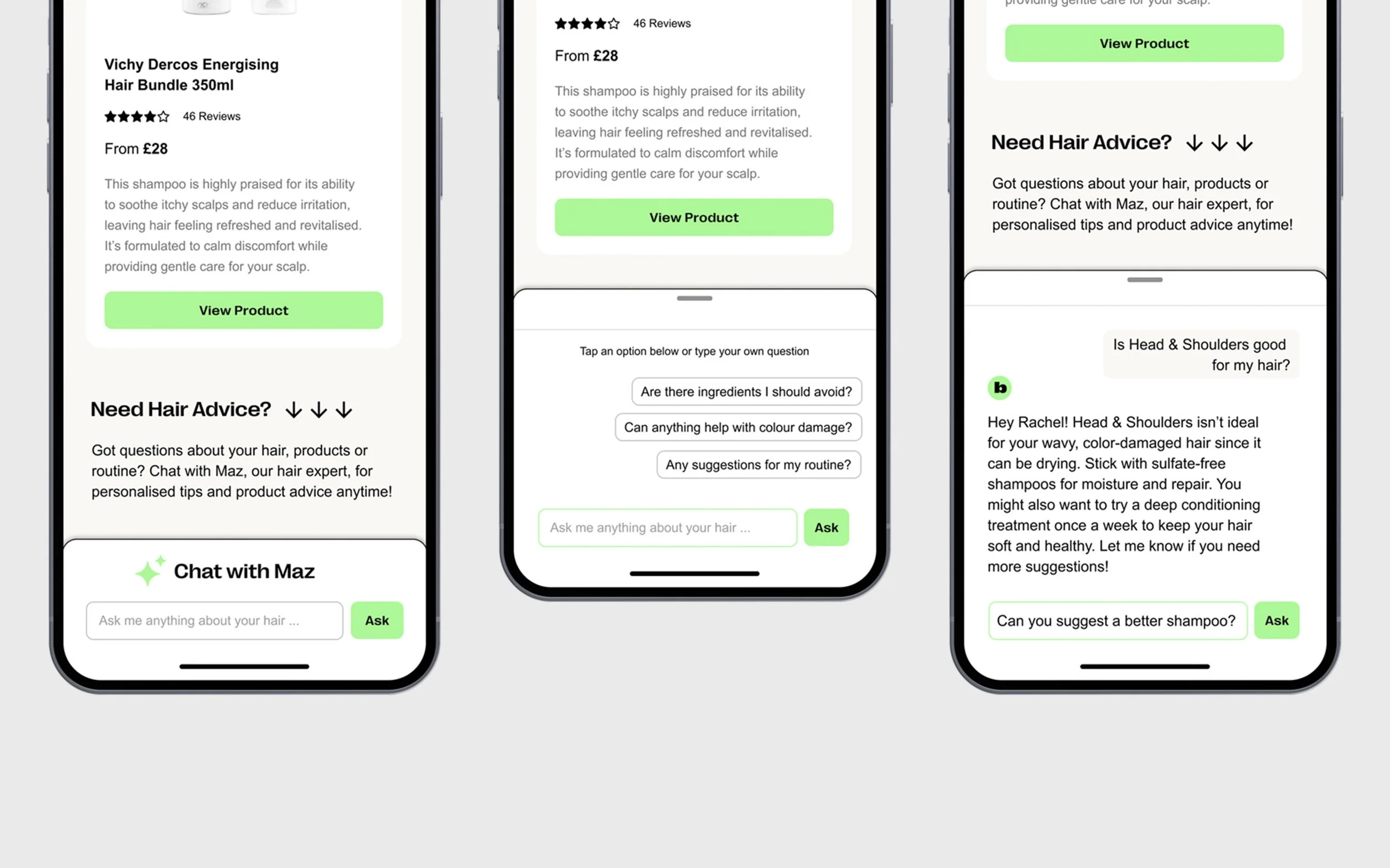
AI hair expert (“Maz”)
Created the interaction model for users to ask personalised questions.
Designed prompts, conversational tone, and message patterns.
Built conversational UX that felt friendly and useful, not gimmicky.
Scoping with engineering
When engineering confirmed we only had structured data for shampoos I:
Reduced the product scope while keeping the IA scalable.
Reframed the product for launch with shampoo as the hero product, with the ability to expand later.
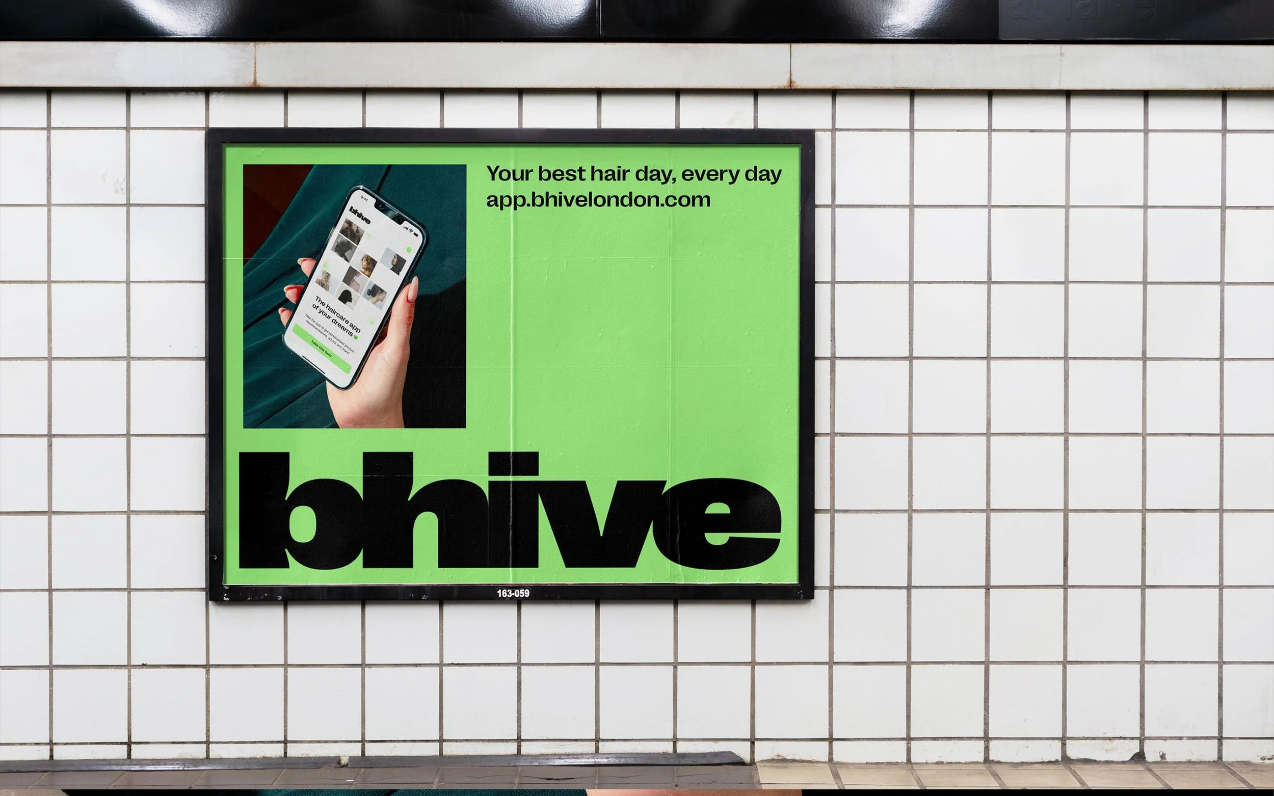
Brand identity
Although the case study focuses on product, creating the visual identity was key to unifying the experience:
Built an inclusive, confident identity using PP Right Grotesk, vibrant green, and diverse portraits.
Ensured the visual language reflected personalisation and empowerment and appealed to GenZ & millennial women.
3. Measuring, testing & iterating
Set up event tracking (e.g., quiz steps, AI usage, product clicks, engagement).
Tested onboarding and recommendations in person.
Iterated copy, button patterns, and quiz flow based on user confusion or drop-off.
Adjusted visual hierarchy to make recommendations clearer.
Not everything was perfect:
Some users expected product comparisons rather than individual recommendations.
Some users overlooked the AI Chat ‘Maz’ or weren’t sure what to ask, so the entry point and guidance needed improving.
Some quiz questions needed rewriting to remove ambiguity.
Impact
Bhive launched with strong traction and validated genuine user need.
User impact:
9.3/10 average recommendation rating
73% return rate
23% weekly user growth in early weeks
12 minutes average time spent on app
Consistent feedback such as “so cool,” “intuitive,” and “Maz was really helpful.”
High engagement in both recommendations and AI chat.
Attracted interest from Boots, M&S, Dyson, and Revlon.
“Really enjoyed Bhive and Maz AI was really helpful. I’ve shared Bhive with friends who also loved it.”
“The app is so clean and simple to use. The quiz was quick and Maz actually understood my hair”
“Finding truly personalised solutions is what it’s all about. We’d love to partner with you”
Reflection
If I were to do this again, I would:
Run more early prototyping and user testing before building the first version of the AI chat to validate tone and usefulness.
Introduce comparisons , as users often wanted side-by-side clarity.
Push for broader product data sooner so recommendations could expand into full routines earlier.
A/B test quiz question order, as small changes had noticeable effects on abandonment.
Overall
This project taught me how to design within constraints, move quickly, and collaborate deeply with engineering, while crafting a user experience that feels simple on the surface and powerful underneath.